Christ Totten is a game developer and professor trained in architecture who released An Architectural Approach to Level Design in 2019. His latest work, Kudzu, is a top down adventure game built in GB Studio that blends adventure and exploration elements from Zelda with non-linear progression like that found in Metroidvania style games. He wrote an in-depth article about the game’s development process, and has allowed us to re-publish a small excerpt from it that focuses on the level design.
Macro-Level Diagramming
I’ve written in the past on how I like to design by mixing a group of genre conventions or influences together and adjusting them until something new emerges. Zelda and Metroid-style games come with their own established conventions. 2D Zelda games are rendered with a top-down view and include dungeons which mediate your progress with puzzles, keys, and tools that widen the player’s set of abilities and which are experienced as small areas separate from a larger “overworld.” 2D Metroid games are rendered from a side-facing view and control your progress in similar ways, but in a world experienced as a large singular maze where the ways that the player affects the environment persist throughout the gameplay session. While seemingly disparate, these two genres share many common elements in how they structure player progression by slowly widening the player’s possibility space, or the amount of things a player can do in the game.
I’m far from the only one to see these similarities. Mark Brown is the creator of the excellent YouTube analysis series Game Maker’s Toolkit. In it, he breaks down the ways in which the design of games work, from general phenomena shared by multiple games, to deep-dives in specific games’ designs. One particularly notable contribution though, is his Boss Keys series, which started as a means of analyzing the dungeon designs in The Legend of Zelda series — with each episode tackling the dungeons from one game in the series. In his episode on the games Oracle of Seasons and Oracle of Ages, Brown invents a diagramming method for visualizing the spatial experience of the dungeons, which I usually call “Boss Keys Diagrams.”
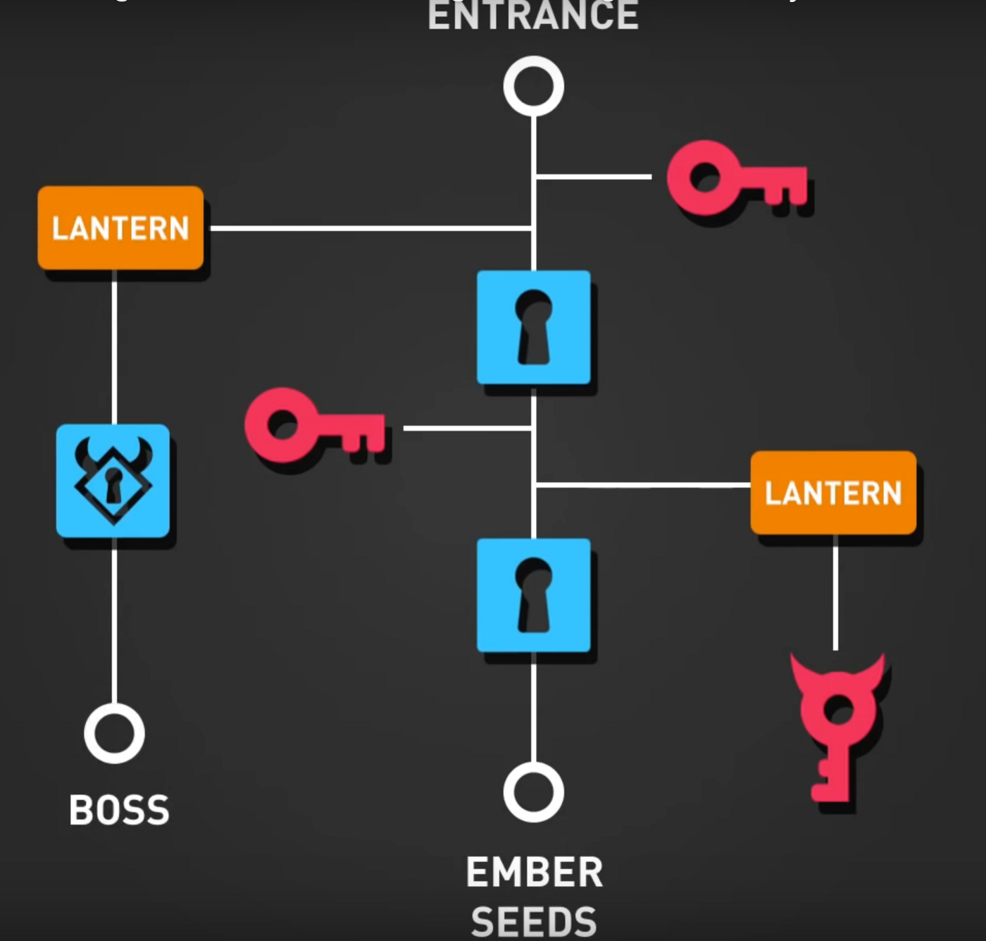
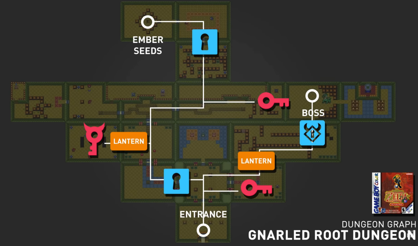
These aren’t literal maps of the environment, but diagrams that show spatial relationships between the pathways that players travel in a level (to the “key item” on which a puzzle’s dungeons are based, to the dungeon boss, etc.) and the mechanisms they use to open that path. In his Oracle video, Brown cites these as an objective way to describe elements like backtracking (does the player need to overly rely on traveling through previously-seen areas) or explorable space, the amount of level real estate that players can visit while otherwise trying to overcome a barrier to their progress.
While Brown uses these diagrams to analyze levels, I’ve also found them helpful as planning tools. They let me map out high-level ideas like how many challenges the player might see before reaching a key point like an important item or the boss. They also let me see where content might be a little thin (little explorable space), telling me that I should maybe add divergent paths for puzzles or hidden surprises. Since Boss Keys’ 2nd season covers Metroidvania games, the diagrams were expanded and new concepts added to Brown’s critical language for discussing these spaces. This addition to the original Boss Keys formula helped make even better diagrams for what I needed.
Micro-Level Room Design
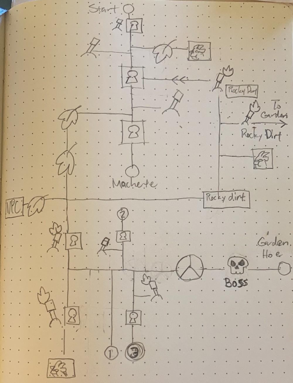
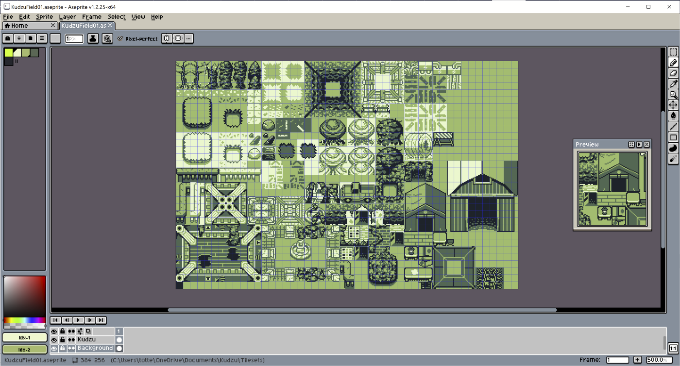
I knew what I wanted generally in a layout, at least from an experience standpoint. One might assume that the next step was to design the actual map layout, but I skipped that step in favor of designing specific rooms first. While this seems counterintuitive, I felt that knowing what kinds of challenges I wanted, as shown in my diagram, would help me create rooms that I could playtest and arrange in the engine until I felt that I got the right pacing, at which point a map would emerge. For this I took 2 steps: the first was to draw a tilemap in Aseprite so that I would understand the visual components that I would use to build level geometry.
Once I had those, I sketched maps on graph paper, treating each square as a 16 x 16 pixel block so that I could see how these elements might create spaces and puzzles. My goal was to draft as many rooms as I could, even if they did not correspond to their final layout or orientation in the map (this mainly affected how door number and location differed from paper to game.)
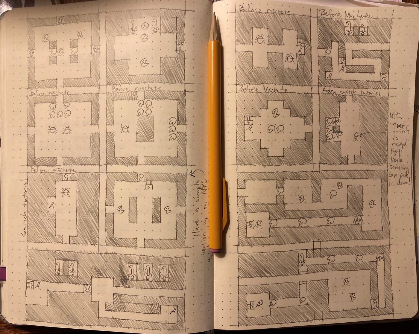
Having these on paper also let me plan out how I’d work within the hard limitations GB Studio puts on designers. Sprites must be 16 x 16 pixels each and the 4 shades of gray/green native to Game Boy. Each scene can have only 10 visible actors (game objects) at a time, 30 actors in a scene overall, and these actors cannot have more than 25 frames of animation total. In addition, each scene background (the pixel image that forms the visual art of the level, on top of which collision is painted in the engine) can only have 192 unique 8 x 8-pixel tiles.
I’ve spoken about my love for the design concept of scenes in the past, which I learned from this book (and which is distinct from how “scenes” is used in the engine.) In the design concept version of scenes, you design challenges to focus on what is in the player’s immediate view at a given time. I think that the limitation of keeping everything in the small area of 1 to 3 Game Boy-sized screens (160 x 144 pixels) and within the actor limits forces this type of design really well. Here, the concept of scenes and the literal use of them in the engine align nicely.
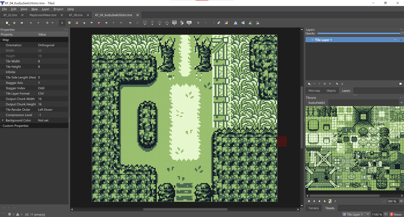
Room designs had to be lean and immediate, and I had to get the most out of only a few puzzle elements, especially to keep scenes within the 10-actor limit. If we had to define these as patterns, we might call them single mechanism challenges and small scenes. Some of these scenes could be highly concentrated with challenging puzzles and others would offer mental downtime, with maybe some easy enemies so the player still feels motivated onward. Once I had rooms mapped out on paper, I built them as background images with my tileset in the Tiled map editor. Normally, I would avoid building maps with the final environment artwork and use draft geometry to graybox the level, but for such small rooms on Game Boy, the time difference between these processes is negligible. If after playtesting, you find that changes to a room are needed, it’s quick to do.
You can read the entire article on Chris’ Medium page, which goes over the story and world building, what it took to put everything together and also includes why he decided to use GB Studio. Chris will be contributing guides over time that go over the scripts he used to implement some of the mechanics.
Game Artist in Residence at American University. Contributor to several independent game productions as an artist, animator, level designer, game designer, and project manager. Totten’s writings on interdisciplinary approaches to game design have earned him guest speaking appearances at GDC China, Dakota State University’s Workshop on Integrated Design in Games, and East Coast Game Conference. (he/him)