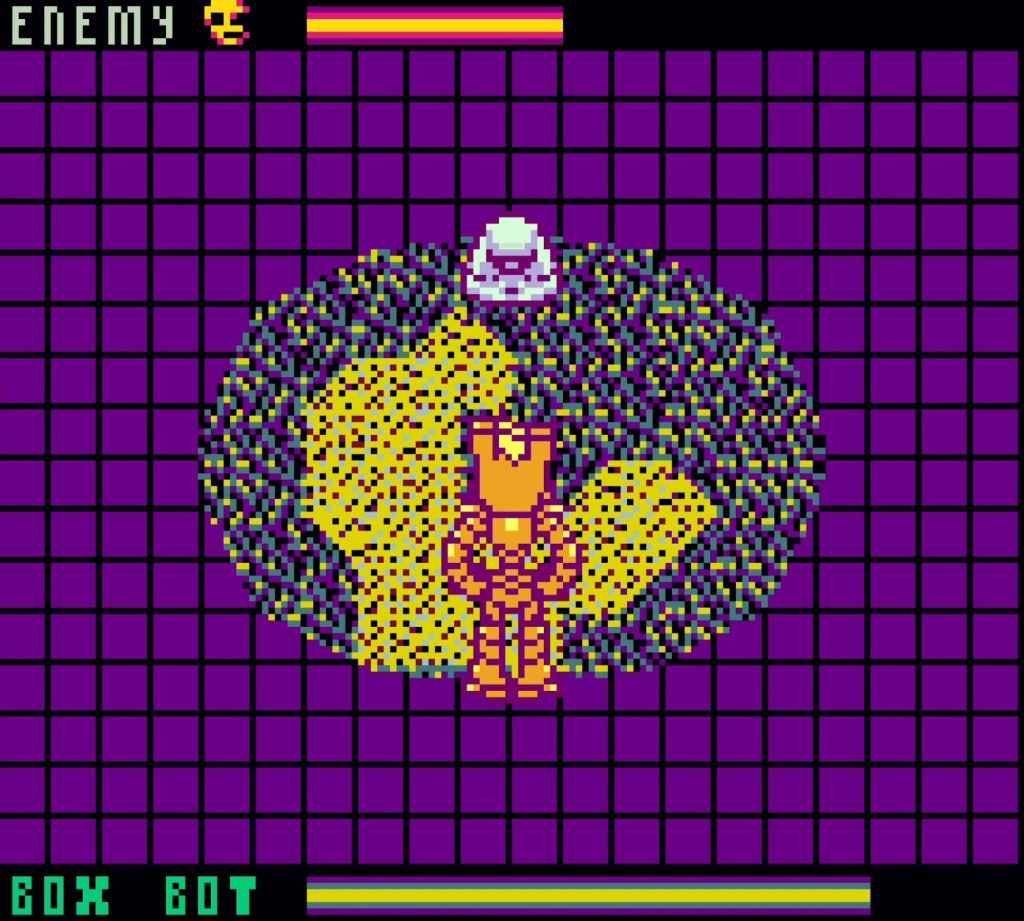
Developer -0 (that’s “negative zero” to you!) has perhaps the most identifiable style of any GB Studio developer. The palettes, the animation, the world-building… it’s all far-out! Through these elements, Developer -0 is pushing to discover new frontiers of what is possible with GB Studio and on the Game Boy Color in general. Not only are these elements unique in that regard, but they are also uniquely his.
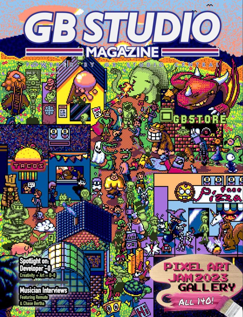
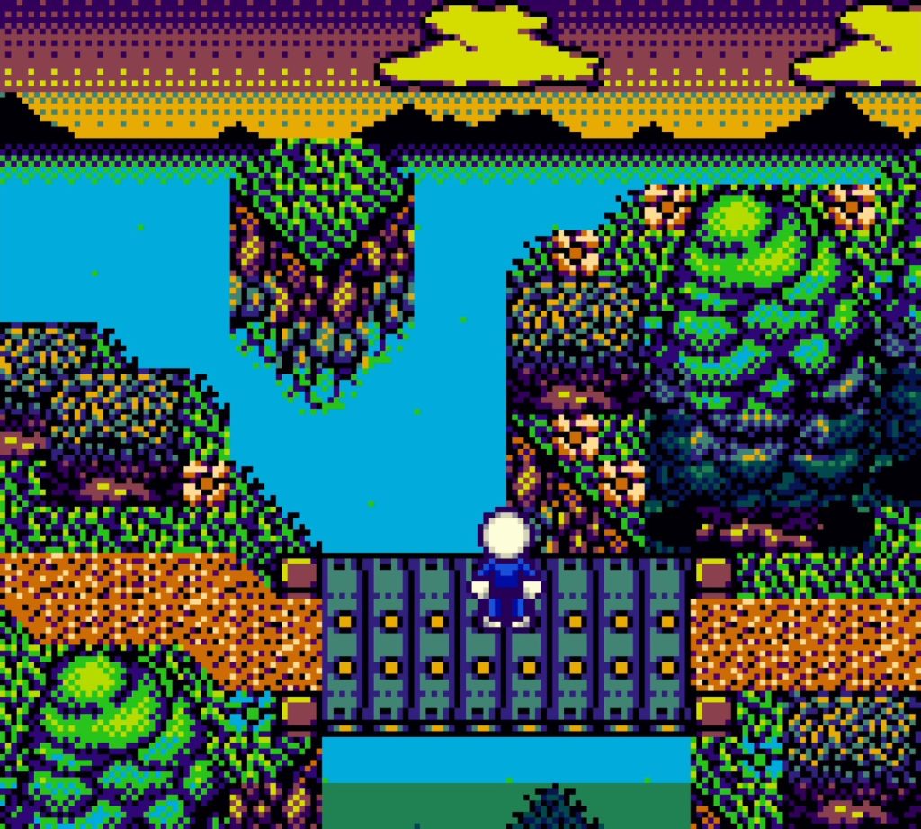
With cartoonish illustration and painterly textures, Developer -0 has forged an easily recognizable style. Playing one of his games feels like playing an 8-bit Saturday morning surrealist, impressionist painting. Both the art and the world have a zaniness that draws the player’s attention. That’s why we were happy to have him craft the vibrant cover of GB Studio Magazine Volume 3!
While there is quite a lot to discuss about Developer -0’s creations, this article will be focused on the art, narrowed in on a fundamental element that is emblematic of the design approach as a whole.
Tilesets that Kick (Gr)ass
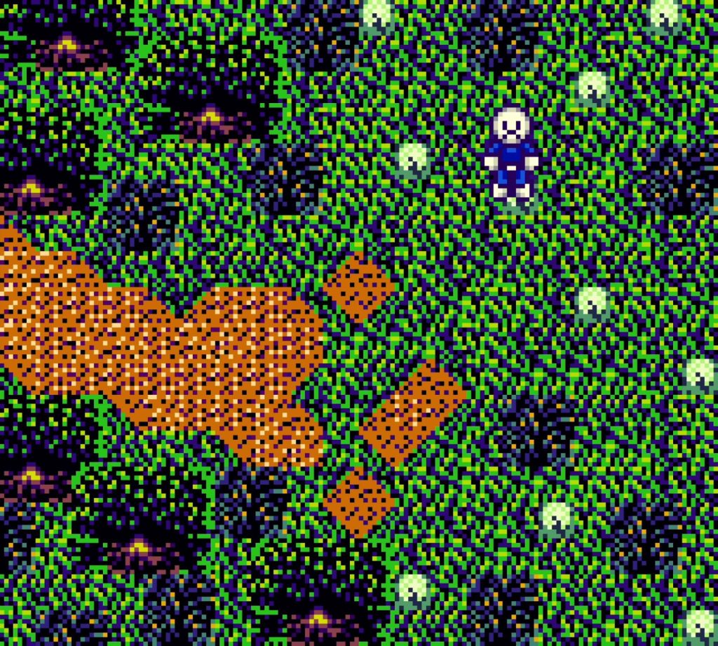
The Impressionistic look of Developer -0’s tilesets and palettes push the 160×144-pixel envelope when it comes to displaying even the most mundane elements with pizazz. Take grass for example. Almost every adventure or role-playing game will have grass as one of its main tilesets, making grass a great standard to showcase Developer -0’s various techniques, juxtaposed against his body of work as a whole and the commercial titles of the Game Boy Color’s era.
Games that Sowed the Seeds
For context, let’s look at two Nintendo-published classics: The Legend of Zelda: Link’s Awakening DX and the second generation of Pokémon titles (Gold, Silver, and Crystal). And note that we are looking at just the ground grass texture, not the interactive tall grass or bushes.
Link’s Awakening DX favors outlines over texture with its flat, single-tone green as the base. The tuft of grass follows suit with a solid dark green that stands out strikingly from the base tone. The edges of each grass patch appear slightly ruffled where the two green tones combine and buttress the light yellow dirt. This combination of greens still serves as a bold border line.
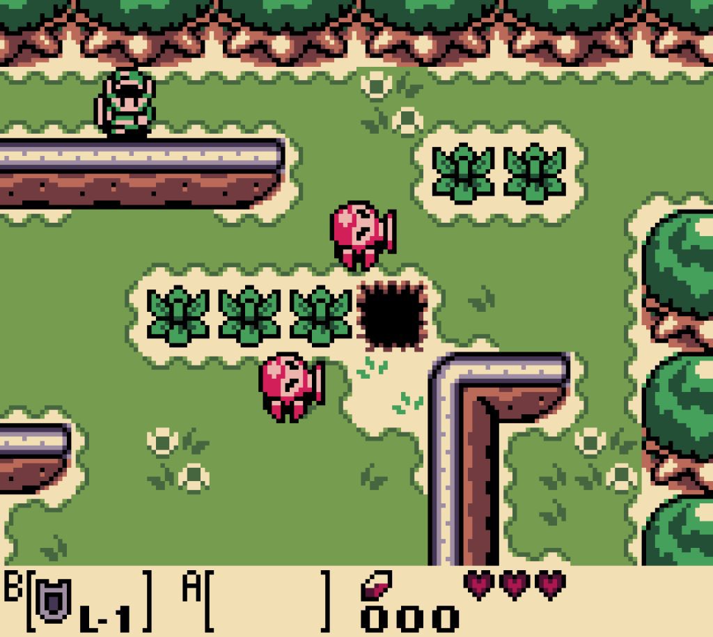
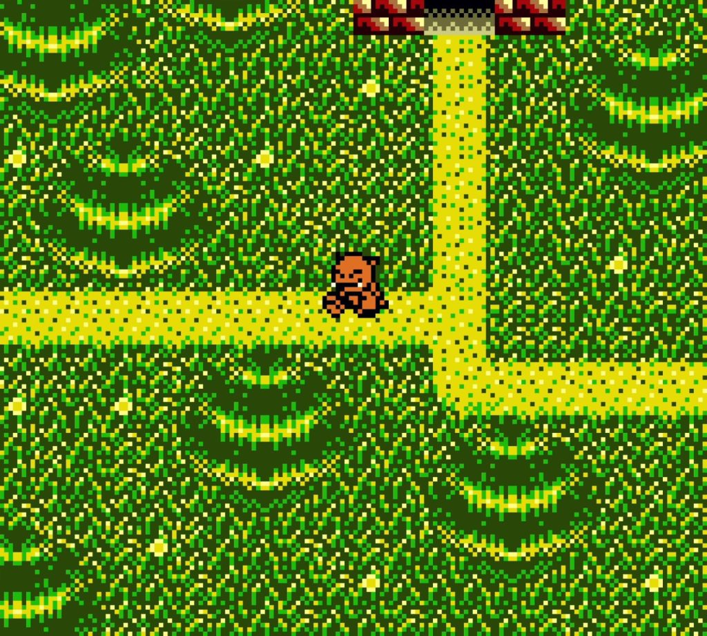
Pokémon favors a more realistic scale with its half lattice-laced and half single tone base. The sections with a plain single tone helps break the pattern and prevent the tiles from looking like one giant dithered area, allowing the lattice-laced sections to look (roughly, maybe if you squint) like patches of grass blades. Additionally, the second-darkest tone is strategically placed to look like the center of both light and dark colored flowers. Sneaky!
By using this singular 8-by-8-px tile on repeat, it blossoms into a whole field!
The darkest tone in the palette though is reserved for solid tiles that the player can’t pass through, such as trees. Link’s Awakening DX also abides by this readability rule too, but Developer -0 takes the road less traveled.
Growing Creativity
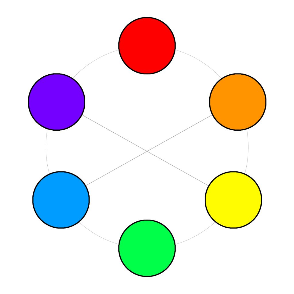
Developer -0’s grass tiles use all four color tones available to a 8-by-8-px tile. What’s even more bold is that the different shades don’t always come from the same color! Starting off slightly more traditional, tiles of the Downward demo feature two tones rooted (pun intended) in green and two in yellow. These two colors are adjacent on the color wheel which is why this tileset looks fairly cohesive, especially when viewed in context of the full screen.
The combination of thick, dark lines contrasting against progressively lighter lines creates a nice impression of tall grass strands in a field. So while using all four tones is a more bold approach, the gradient grouping of the lighter colors makes for a tileset that is ultimately not too off the wall. Still, his later tilesets are about as daring as a developer can get.
The pairing of yellow and green really make the red-orange player pop while not having too much contrast.
The Eternal Memory demo and Boxed In share the same tileset (many of Boxed In’s assets came from the Eternal Memory demo to create a new game for Game Boy Showdown 2023’s tight timeframe), yet they do not share the same palette.
The colors in Eternal Memory from lightest tone to darkest include yellowish-green, bright green, dark indigo, and black. The yellowish-green and bright green are obviously very similar, but the dark indigo adds another secondary color which, while different (especially by being dark while the green is light), is still a rather agreeable pairing. In fact, the dark indigo skews slightly blue, which groups it even closer to green. All in all, it deviates from the norm, but doesn’t quite take it out to the extent that Boxed In does.
Almost feels like a new species of organic digital life is sprouting out of the Game Boy screen!
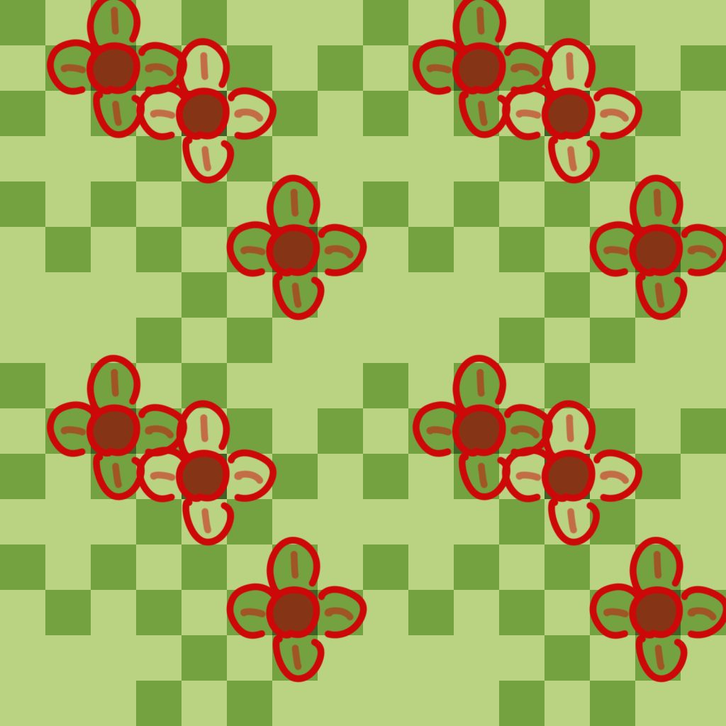
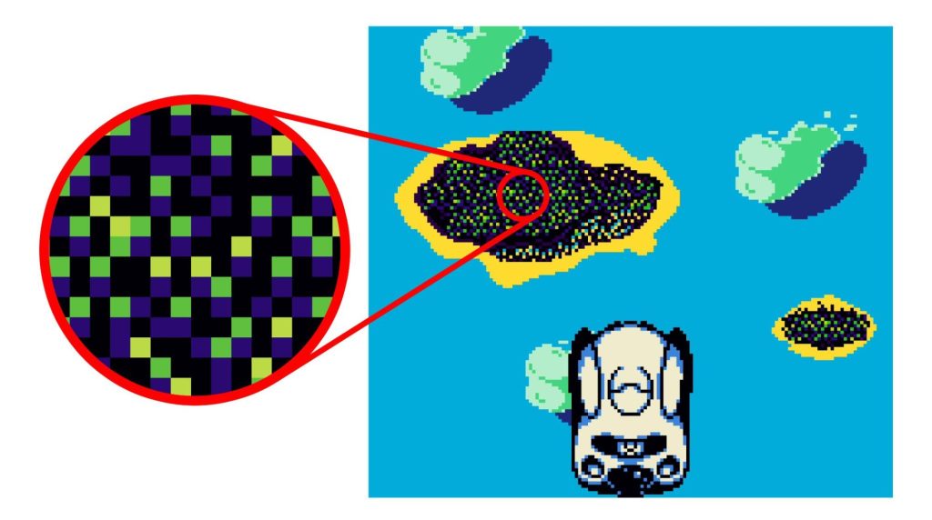
Boxed In ironically has the most think-outside-of-the-box approach yet. From lightest to darkest, the tones here are yellow, grayish-turquoise, violet, and black. Wow.
Right off the bat, notice the use of two unusual colors (yellow and violet) that are on opposite ends of the color wheel, achieving the highest contrast possible between colors. This prevents the colors from melding together like they would in a traditional dithering pattern of closely-shaded colors.
The black and grayish-turquoise remain, the latter of which provides the neutrality of gray while keeping its vibrancy. This is probably the wildest one can get while still keeping it grounded (again, pun intended) for readability.
The circular contrast against the basic grid really makes it feel like an ethereal tuft of land.
Making an Impression
The way that these crazy tiles and palettes achieve readability is purely thanks to the extremely small (often a single pixel) grouping of the colors on the tile. First, there’s the challenge of creating a readable grass texture. When looking at these tiles in-game, the smattering of tiny colors that splash across a 160-by-144-px screen as a whole appear like a woven texture that both blends well and maintains the impression of many individual elements, just like an impressionist painting.
To understand this better, let’s take a look at perhaps the most famous impressionist painting there is, Claude Monet’s Bridge over a Pond of Lillies from 1899 (a hundred years later and he would’ve been a wonderful pixel artist!). This painting is almost entirely composed of short brush strokes of various colors that, when viewed from afar, create an image with depth and life.
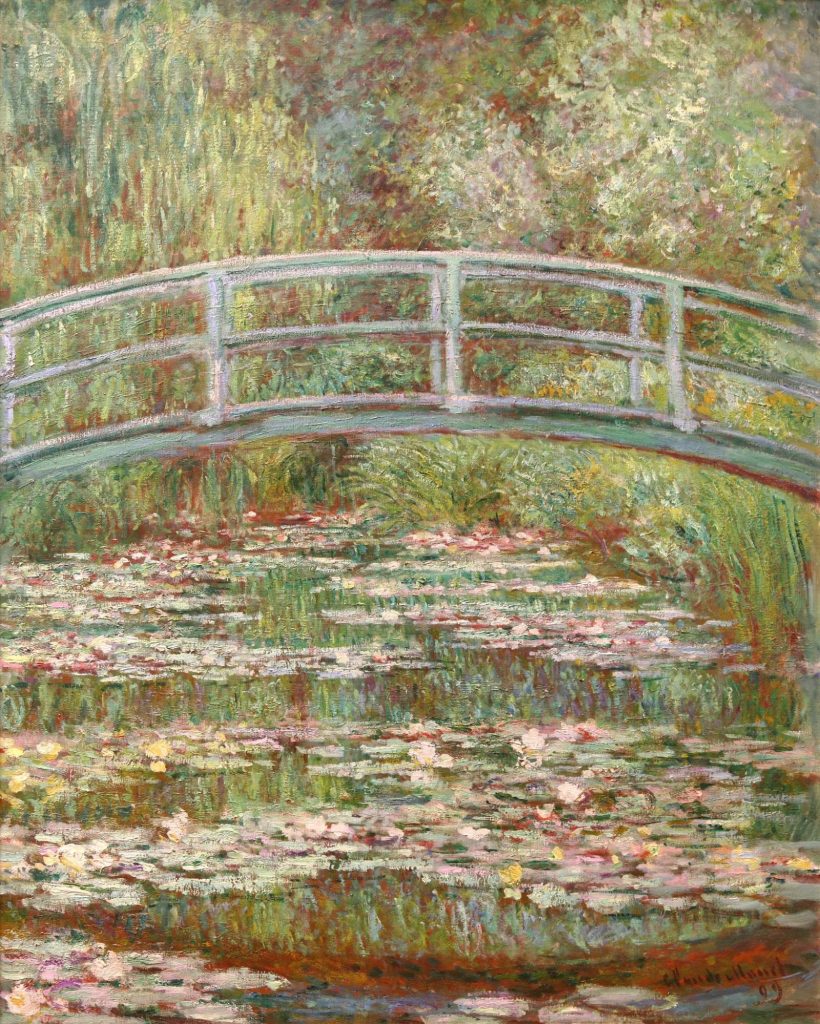
And would you look at that? Monet used green and red together; opposite colors for a single texture just like the ones found in Boxed In. These small, seemingly chaotic dashes of color and contrast work because they are found in nature at small scales. Games like the Pokémon series approach this technique but Developer -0 sends it full blast — wringing a lively landscape out of ones and (negative) zeros.
In Full Bloom
With such a wide variety of developers in the GB Studio community, most identifiable is a bold but fitting moniker for Developer -0. This article only scratches the surface, while there are many other creative elements in his games, such as animation, world and even development technique. To see it all in full force, check out his itch.io page and play around! To keep up with his latest project updates, stay tuned to his X and Instagram.