
Throughout the great age of video games, there have always been releases that have raised eyebrows for all the wrong reasons. Licensed Nintendo games have, from time to time, graced the store shelf plagued with questionable art direction, sloppy storytelling and just plain old odd game design choices. And while we can’t know the details of every behind the scenes story when it comes to the more disastrous licensed releases on the Game Boy, it does pay to ask the question:
What makes a “bad” Game Boy game bad?
This series will shine a light on this subject in the hope that by learning about “bad” game design, we can better understand what makes a game “good”.
Before we start, I must stress again, we can’t know the developers’ story most of the time. It’s often impossible to say whether the outcome of a terrible game was the result of poor dev team management, lack of funds, time constraints or some other wrinkle in the development timeline. Sometimes, a “bad” game is bad simply because someone wanted to push a release out quickly to coincide with the latest fad or film. Not to mention developing Game Boy games back then was a lot harder! One could only imagine what some of the GB developers of the 80s, 90s and 2000s could have achieved with an IDE like GB Studio. In any case, I wish to stress that this isn’t an opportunity to make fun of games. Developers are real people with real feelings after all. Instead, I want to approach this as a learning exercise, a chance to reiterate – which is itself an essential part of game development in the first place. I’d like to approach this series more as constructive criticism rather than just criticism on it’s own… but that doesn’t mean we can’t have (perhaps a little) fun during the process.
So without further ado, let’s discuss our first outing in questionable game design. Let’s talk about the green elephant in the room, as it were: Shrek: Fairy Tale Freakdown!
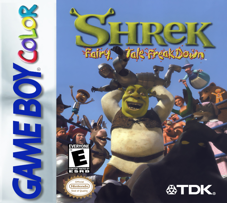
Shrek: Fairy Tale Freakdown is a single player fighting game developed by Prolific and published in 2001 by TDK Mediactive. It garnered negative reviews upon release and is considered one of the worst fighting games of all time. But what is it about this title has the critics (and public alike) so baffled?
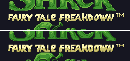
For starters, let’s take a look at the splash screen:
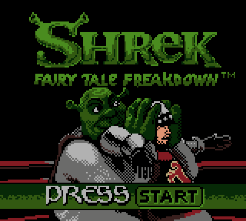
It looks kind of… raw, doesn’t it? Take a moment to assess the aesthetics here. What about it gives it this harsh quality?
Well, I would say the dark tones against the black background give it a very ominous feeling. It doesn’t give the impression this game is based on a film which is itself an homage to the fairy tales of old. But then again, it is a fighting game… and Shrek does look like he is about to happily squash this guard’s head like an egg! What else? The color palette of Shrek’s shirt is the same color as the guards armor, so the line between Shrek and his opponent is not as clear as it could be. The iconic “Shrek” text with the ogre ears looks as if it was scaled down from a JPEG image to fit the low resolution Game Boy screen and has been corrupted as a result. Finally, the dithering used here is quite scattered, giving the image a very noisy quality.
Let’s see what we can do to solve some of these issues.
To start, we can take a look at the palette. I have set some rules for myself when applying a new color palette. We will have to follow the limitations of Game Boy development (obviously). That means we can’t have more than 4 unique colors applied to an 8×8 pixel tile. And we have to limit ourselves to 8 unique palettes over the entire image.
Let’s get Redux’ing!
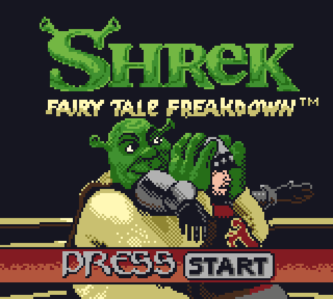
Here we are! I don’t want to stray too far from the original developer’s vision, so the color palettes are intentionally similar, but here is a breakdown of my creative choices:
- The green values have been increased and shifted towards a more yellow hue to brighten up the image.
- Shrek’s shirt has been separated from the guard’s armor by giving it an off-white color.
- ‘Fairy Tale Freakdown ™’ has been colored with the same off-white palette to break up the title and subtitle, create a separation of the text and the image while at the same time, balancing the overall palette of the image.
- The ‘Press Start’ overlay has been colored red to make it stand out more.
- The black background’s value has been increased slightly and given a slight blue tint to connect the greens and reds (blue is a center point on the color spectrum between red and green).
- The wrestling rings’ ropes have been changed to off-white to make them visually distinct from the now red ‘Press Start overlay.
It’s looking a bit better, but we are not done yet. Before we move on though, I want to say that we are not looking to just redo the graphics in totality. Sure, we could hire a professional pixel artist, have them apply their own style and end up with a beautiful portrait of Shrek about to squash a man’s head, but that would defeat the point of this learning exercise. Instead, we are looking to revise the piece by specifically tackling the minutiae of the graphics. Earlier I said that the image felt raw because there was a lot of noise… in that case, we will look at ways to soften the artwork rather than just scrap it all together. We are trying to respect the original vision of the developers, after all.
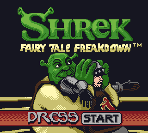
The final Reduxed version has gone through what looks like many changes. In fact, I have only applied two techniques to turn this frog into a prince (relatively speaking, at least).
Anti Aliasing
By virtue of the very pixels we use to construct pixel art, it’s all too easy to end up with harsh edges when creating assets. But by applying anti aliasing to these edges, we can soften them greatly. I have applied anti aliasing to a great deal of the image but the main points of interest were the text, wrestling ring ropes, Shrek and the guard. Actually, it’s been applied to all but the ‘Press Start’ overlay.
Applying anti aliasing can seem like a very mysterious process to a beginner, but ultimately it’s no secret and simply requires practice. It boils down to this; Do you see a hard edge between two adjacent colors that is too high contrast and requires softening? Then start stepping the value of the color down towards a darker tone and apply it to the edge if the background is a darker color or stepping it up if the background is a lighter color. It can get more complex than that (depending on the adjacent colors) but you will be off to a good start if you’re a budding pixel artist. Because we are limited to 4 unique colors per tile too, there are limitations to how many “steps” you can use when applying this technique.
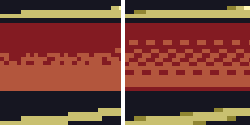
Patterned Dithering
Placing pixels randomly will create a very noisy texture. Fine if you want to achieve something sandy or rough, but elements such as the ‘Press Start’ overlay would be more effective as a relatively smoother texture. By applying a patterned dithering effect, we can create a gradual shading that maintains a clean aesthetic. It’s worthwhile experimenting with different patterns and saving them for reference to be used on future projects.
You will notice that while I reduced the noise of Shrek’s shirt, I kept the simple cross-hatch dither effect because the shirt has a rough fabric texture itself.
To finish, let’s look at a comparison between the two splash screens:
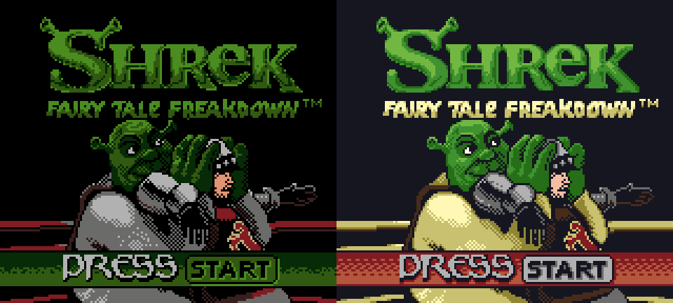
As I alluded to earlier, Game Boy development has become significantly easier thanks to contemporary software such as GB Studio and GBDK – especially for artists! So we should be lenient when exploring these “bad” Game Boy titles in future. For now, it’s fair to say Shrek: Fairy Tale Freakdown is infamous for many reasons, but as seen here, it doesn’t take long to improve even the most questionable aspects of its design through reiteration.
Independent Games Designer, Artist, Film Enthusiast and Full-time Dad (he/him). Check out my games here!