The Metroidvania genre is a sprawling landscape of varied mechanics and ideas so broad that many gamers, devs, and especially journalists are pushing hard to change the name of the genre itself. Something that describes its many features rather than merely referencing two of its big hitters. Whether you call it a Search Action, Pathfinder Platformer, Platform Adventure, Exploratory Platformer, Metroidvania or otherwise, ever since Brain Breaker came out in 1985 (there are probably even earlier examples of earlier titles), the genre has had to solve some serious game design problems in its time.
For those that haven’t played a Metroidvania in a while (or at all) they are typically associated with:
- Large, open worlds that the player is free to explore
- Areas that are locked behind doors or obstacles
- New abilities that can be acquired, which in turn open up new areas of the map
So when I say “the genre has had to solve some serious game design problems”, what do I mean exactly? Well, for many players who decide to jump into a Metroidvania, the task of exploring a large, open world that slowly unlocks as you find progression items can leave the player feeling lost and directionless as they attempt to locate that next key for its respective lock or vice-versa. This can be so utterly frustrating that some gamers actively avoid the genre for this reason and it’s really no surprise when we take a look at some of the earlier titles that seeded the genre.
Confession time… I have attempted Metroid on the NES a total of three times and completed it a total of zero times! “Oh my gosh, what a NOOB!” I hear you say. Well, that may be true. However, I have also completed (and love) Metroid: Zero Mission, the 2004 remake of the original 1986 game, this time on the GBA.
So what’s the difference here? Why did I love my experience with Metroid: Zero Mission, while my attempts to love Metroid (1986) keep falling short? The answer to this riddle is mainly due to its map system!
And this brings us to our current GB Classic Spotlight on Teenage Mutant Ninja Turtles III: Radical Rescue, the first Metroidvania to use a modern map system – a now essential component of Metroidvanias across the board!
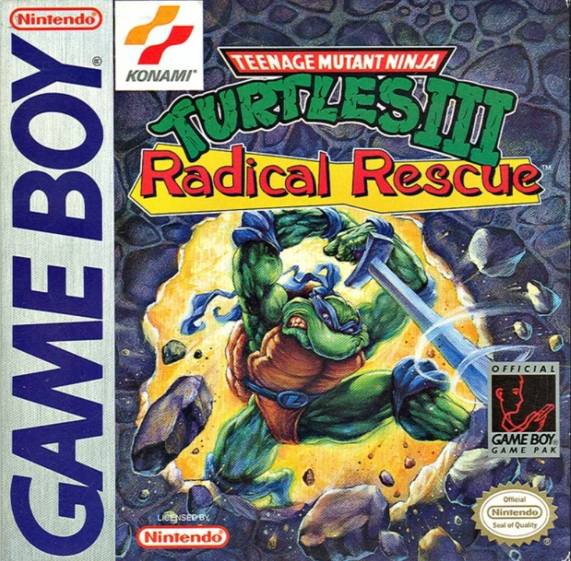
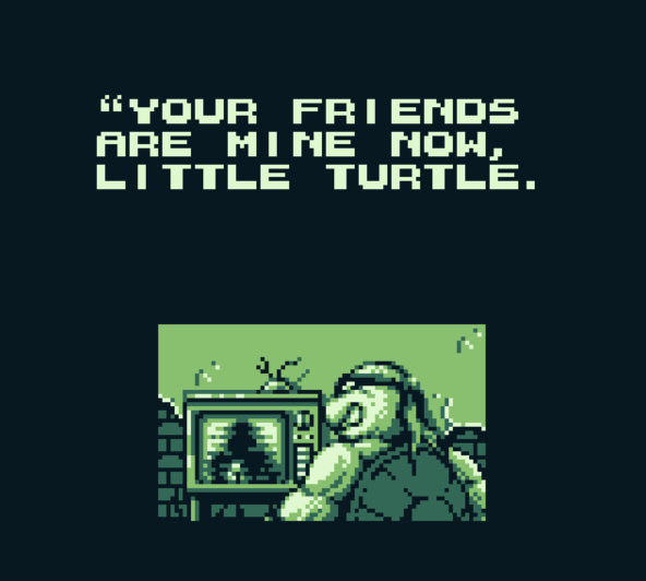
Teenage Mutant Ninja Turtles III: Radical Rescue is an early Metroidvania developed by Konami and released in 1993. Michelangelo returns to the Sewers after getting some pizza for the gang, only to find that Shredder has kidnapped the other Turtles, April O’Neil, and Splinter. It’s up to Michelangelo to save everyone!
The player is tasked with exploring a labyrinth filled with enemies, obstacles, and bosses as they try to locate Leonardo, Raphael and Donatello, who are all locked in cells dotted around the map. The game play loop is as follows:
- Use new ability to explore expanded environment
- Locate boss
- Defeat boss to acquire a key
- Locate locked cell and use the key to
- Save the next Turtle
- Repeat
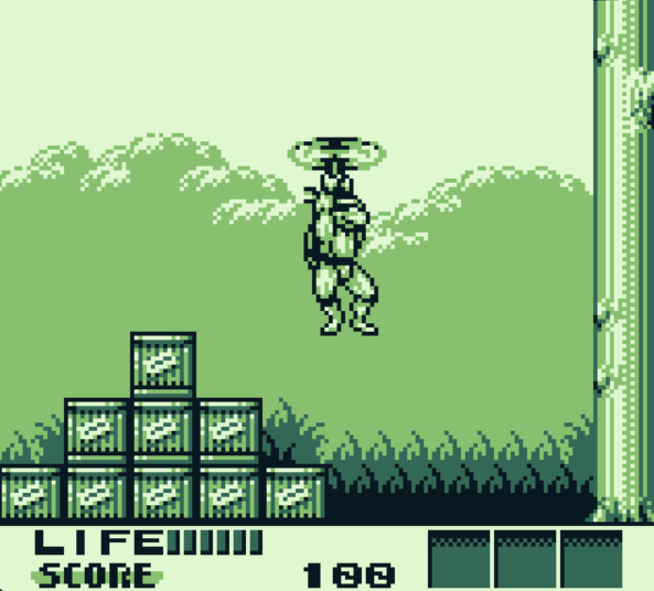
Each Turtle you save will allow the player to switch to them, and thereby use a new ability unique to each of the reptilian pizza lovers. Michelangelo can hover using his nun-chucks, Leonardo can drill down certain blocks using his katanas, Raphael can slip inside his shell to shimmy through small holes in the walls (morph ball *cough*) and Donatello can cling to and climb walls.
So there it is, each new ability will open up a new area of the map and the cycle repeats. This is the core of the classic Metroidvania formula. But as I alluded to earlier, it’s the map system that makes this particular game so important to the history of the Metroidvania genre at large. Let’s take a look at TMNT III‘s map system now and explore how its inclusion goes a long way to address the problem of players becoming lost and frustrated during periods of exploration.
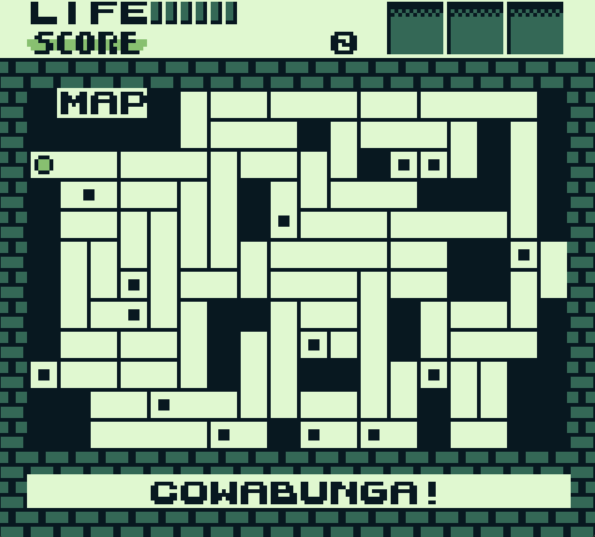
Pressing “Select” will bring the above map into view. We can plainly see that it’s giving the player a considerable amount of information when it comes to exploration. The larger dot (seen top left of the map) shows the player’s location while the smaller black dots are points of interest necessary to progress to the end of the game. These will be one of three things:
- A boss (and a boss key once that boss is defeated)
- A key card (which opens locked doors found throughout Shredder’s labyrinth) or
- Cell doors that contain one of the kidnapped Turtles (opened using a boss key)
As the player, it’s up to you to figure out what each point of interest actually is and, thanks to this map, exploration is no longer akin to wandering around a dark cave without a flashlight. However when you need to find a boss before a cell door for example, picking one of these dots at random and heading to its location (if you can actually get there in the first place) can lead to wasted time and more frustration if you choose poorly! While it’s certainly much more convenient to know where you are relative to some progression item on a map, the information presented in this version of the game is still making exploration somewhat tedious and annoying at times. But let’s take a look at the Japanese version, released at the same time as the US and EUR versions…
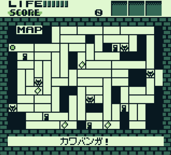
Well, well, well… the Japanese version’s map has some very big differences compared to its western counterparts! Now we not only know where we are relative to the points of interest in the game, we also know exactly what each point of interest is thanks to unique icons scattered all over the map!
Comparing these two maps offers insight into a great rule of thumb when designing our own maps. And that is:
As map information increases, exploration difficulty and moments of frustration decrease.
It’s up to the developer to decide how hard they want exploration to be. If there is no map at all, then the exploration becomes an exercise in memory or in the player’s own map-building ability. On the other hand, if the map is giving away too much, then the player isn’t left with that satisfying feeling of self-accomplishment. Of course, the way a labyrinth is designed also plays into its difficulty, and how a point of interest is visually designed and etched into our memory goes a long way too (the golden statue chamber in Super Metroid is particularly memorable!) but it’s the information placed on a map that really assists players in figuring out where to go next.
What if, for example, TMNT III: Radical Rescue had save rooms much like Super Metroid rather than a password system, and those locations were indicated using the same black dot as everything else rather than an “S” marked on the map? I’m guessing saving your game would become extremely frustrating when you walk into a boss room instead of what you thought was a save room. Or what if the map showed exactly where doors and ladders were in each room, and therefore how the matrix of rooms interconnects? Well, that would make finding the path to the next item even easier and probably make the experience less frustrating for some players too. These are the kinds of variables the developer can modulate in order to create an experience they deem engaging.
Deciding what information to give or withhold will create any number of permutations in difficulty and whether subtly or overtly, will affect the player experience in a substantial way. Sometimes I think handheld games are criminally overlooked when it comes to recognizing their contribution to innovation in game design and Teenage Mutant Ninja Turtles III: Radical Rescue would be one of the prime examples in my opinion. After all, this particular game’s map system marked a considerable step forward in the genre and, more importantly, the game itself acts as a precursor to Konami’s own Castlevania: Symphony of the Night, literally the defining title in the Metroidvania genre.
Independent Games Designer, Artist, Film Enthusiast and Full-time Dad (he/him). Check out my games here!