While the Game Boy Color can only display 56 colors screen at any one time, it is able to select those from a range of 32,768 colors, so don’t blame yourself if you think palette selection is overwhelming at times! If you decide to enable color mode in GB Studio for your game, then this article aims to break down the decision making process, offer some tips, and explore the various options at our disposal when it comes to all things color. For a in-depth look into how colors are displayed on various hardware, check out SōdoDevs article here. Otherwise, let’s get into color theory.
If you want a primer or a recap on basic terms then you can read on, otherwise skip ahead to the next section.
Definitions
Hue – is a gradation or variety of color. It refers to a specific ‘slice’ of the color wheel or point along the color spectrum.
Saturation – is the measure of intensity of a color. The lower the intensity the more dull/grey the color will appear.
Value – is the measure of the lightness or darkness of a color. Here also referred to as Tone.
Complimentary Colors – are two colors that sit at opposite sides of the color wheel. For example: Green and Red, Blue and Orange or Purple and Yellow.
Analogous Colors – are colors that sit adjacent to each other on the color wheel. For example: Green, Cyan and Blue.
Now that the basics are covered, let’s get on with it!
Readability using Color
In the last chapter, we saw how placing an area of light value next to an area of dark value can create a high tonal contrast between objects in a scene, thereby increasing readability during game play. Colors can also achieve a similar outcome when used in certain ways.
Complementary colors will draw the eye into areas where both meet, and create a vibrant, lively scene at the same time. For example, by placing a red enemy over some green foliage in the background, it ensures the player will be able to clearly see the danger ahead. When applied to elements such as interactable objects, the developer can signal to the player that attention should be directed towards these items or points of interest. Using analogous colors in the same way will make it more difficult for the player to read the environment around them as points of interest may end up ‘blending in’ too much. This can lead to feelings of frustration or confusion for the player.
Ben Jelter has used analogous blue colors to build the background palette and then applied complimentary colors to the points of interest (namely the pushable rocks, the resource that is required to clear the stage, an optional tutorial on the interactable sign and the player character) in this scene from Unearthed (2021).
While analogous colors won’t highlight points of interest such as enemies, obstacles or collectibles in a scene, they can go a long way towards building a more rich and dynamic one. Slight to moderate shifts in hue will subtly transform a scene from looking monochromatic and relatively dull into something that is more striking.
Using saturated colors alongside a similar unsaturated hue is another alternative when creating contrasting areas within a scene. The high intensity of the color will feel like something is ‘jumping out’ or seemingly closer to player while a more muted, unsaturated color pushes itself into the background. By using these properties to our advantage, we can create a sense of depth using a single hue. This is also true when utilizing the difference in value of a hue. In this regard, its worth applying the lessons shown in my readability article when incorporating color into a scene as well.
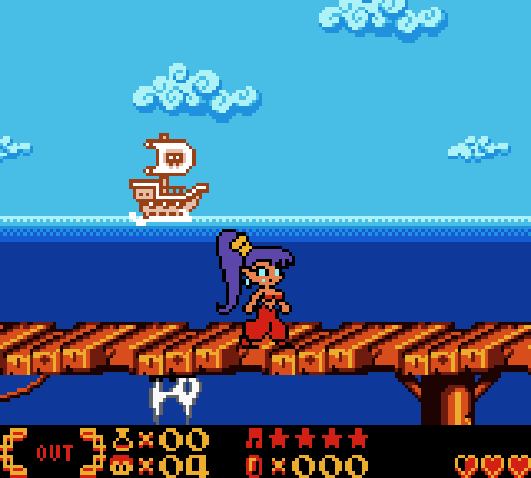
In the opening minutes of Shantae (2002), the artist has used a very saturated brown for the bridge in the foreground but the brown of the ship in the distant background has been heavily de-saturated. Like wise, so too have the shadow values been pushed to a near black tone in the foreground, but set to a relatively pale dark brown on the ship. Both choices give the illusion of depth (as well as improve readability during game play).
In the Ocean Base stage from Megaman Xtreme 2, the highly saturated orange sand compliments the ‘blue’ sand that is submerged in water. By de-saturating the submerged sand as well, it makes it feel like the water is more viscous than the air around X. Both palette decisions have worked to accentuate the difference in player movement physics between X traveling through the air and water as a result.
1-Bit Palettes
When referring to pixel art, palettes of this style use only 2 colors to convey visual information on screen at any one time. Due to its intrinsic simplicity, it’s a great way to explore color selection as an entry point, especially when learning about how specific colors can affect our own emotions – a useful tool when conveying mood in a narrative sense. The binary nature of this palette means you can utilize any two colors you like (although a typical example usually features black and white).
I mention black and white palettes only because, thanks to the improved Game Boy Color screen, dark tones no longer smear when the view is in motion as with the DMG and Game Boy Pocket. This means the developer is free to finally use black as a background color without the fear of rendering their game unplayable on the older Game Boys.
If you are thinking of using a 1-Bit palette, it’s important to note; It can be harder to direct the player’s attention towards a point of interest when color and tonal contrasts are not an option. However, there are many other solutions to this problem:
- Using movement/animation will draw the eye.
- Increased detail/reduced detail over adjacent areas can also create contrast.
- Incorporating lines into the background artwork or level design itself can act to direct the player’s eye towards points of interest during game play.
In Filipe Bianchin’s Fix My Heart, the textured rock formation and the large white area surrounding the cave’s door both work to draw the player’s attention towards the right side of the screen, zeroing in on the way forward. Additionally, the single, unbroken horizontal platform creates a line from the player character, directly to the door. It is very clear what must be done.
Minimalist Palettes
By introducing a few more colors into the 1-Bit palette, we can easily draw the player’s attention towards points of interest, dangerous obstacles or enemies, interactable objects etc. without getting bogged down in color management.
Additionally, by using varied tones of the same hue, depth can be created within a scene while still maintaining decent readability.
In this scene from an unreleased proof of concept of mine, I have used white against black to create a foreground, an intermediate value (gray) to create background detail and some high contrast colors to highlight points of interest such as the door, the fuse box and the weapons upgrade.
Minimalist palettes are quick to produce, keep the visuals clean and easily readable and focus the decision making towards game play above all else. It’s another great way to dip your toes into the world of color without feeling like you may drown!
Retro Palettes
Before we let all the colors loose, another option is to self impose limitations. If you want a scene to be more colorful than a minimalist palette but are not ready to deal with the scope of the “anything goes” approach, then picking a palette from any number of the retro consoles is a great way to impose these limitations (and pay homage to great consoles from past decades too). It’s an excellent way to explore how color can affect a scene without having to deal with an overabundance of choice.
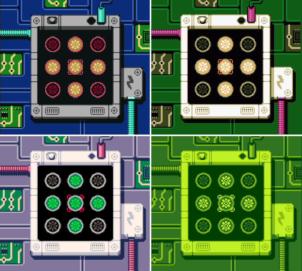
A similar approach is to find ready made palettes online. I have found Lospec to be extremely useful as it’s a database for pixel art palettes – and therefore great for games.
All the Colors of the Rainbow
Going beyond the Minimalist and Retro palettes means the options are greatly expanded. For many, this is where choosing a cohesive, balanced palette that hits all the right notes is somewhat shrouded in mystery. But if we take things slowly, we will be able to navigate color selection for any project.
The best place to start is by using one of the free tools available to us on the internet. Here is a great tool by Paletton or another by Adobe (and let’s not forget Coolors!), if you want to start playing around immediately. These will do a lot of the heavy lifting for you, as different palette styles can be selected with ease. And by combining some of the readability principles discussed above, you will already be off to a good start. It’s just a matter of transferring your chosen colors into the GB Studio palette creator tool and making sure they translate well to the 8×8 pixel tiles.
Let’s take a look at an example. Below is a screenshot of a menu from Dogz, a Game Boy Color game released in 1999.
There is nothing particularly wrong with the readability here. Yes, you can read all the information in the menu, but the various highly saturated colors in this palette are fighting one another for attention. Let’s revamp this menu with a quick trip to one of the palette building tools I mentioned above, and attempt to bring some harmony to this screen…
Studying the Greats (and not-so-Greats)!
Exploring the large catalogue of GBC games already available to us is a great source of inspiration (and for that matter, why not check out the NES titles, too) Studying the palettes of great games is well worth the time and effort but it doesn’t hurt to analyze poorly crafted palettes as well – comparing what works to what doesn’t work and understanding why will go a long way towards the creation of your own palettes.
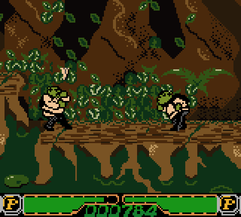
What’s more, studying the palettes of games rather than any old palette you find on the internet means you can see how that palette has been applied – after all, they have been crafted with game play in mind.
This is the ultimate goal when it comes to deciding what colors to use in your game. Yes, it’s great to have something that looks absolutely amazing but color is ultimately another tool in service of the game play. A great looking palette applied over some great looking pixel art can excite any retro gaming fan, but the bottom line is: it must also readily convey important game play information at the same time.
The final thing I’d like to add is the most important principle of color palette creation, in my opinion. I’ve saved it to last in an attempt to have it burn into your memory. And that is:
Keep it Simple!
The human brain tends to ‘shut off’ when overloaded with too much information. It’s the same reason babies cry when they get over stimulated, or when we walk into a supermarket without a shopping list, we sometimes forget what we came in there for. In other words, too much information just translates to noise, and when we play a game that translates to disengagement or confusion in some way. Take a look at any bullet-hell and you will notice just how much attention is given to the color palette to make sure the player can easily read the huge amount of moving objects on screen. For this reason, the best thing for easily readable game play is to keep the on-screen palette focused.
For those that shy away from the sometimes complex world of color, I hope this article has inflated your confidence enough to explore how color can enhance your own project. So why not tick that ‘enable color mode’ checkbox in GB Studio and start painting!
In the next Chapter, we will explore the various ways a developer can maximize replayability in their game.
Independent Games Designer, Artist, Film Enthusiast and Full-time Dad (he/him). Check out my games here!
