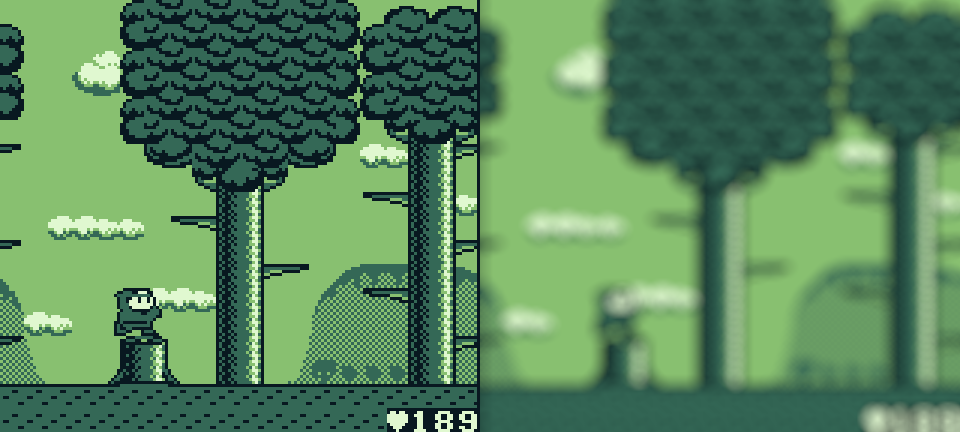
Have you ever heard of a game called Maru’s Mission? If you haven’t, you are among the vast majority. It’s a largely forgotten action platformer that stumbled onto the Game Boy back in 1991, and I do mean stumbled. It has… problems. It’s quite buggy and the player character controls are just baffling! But its biggest issue, at least to me, is its poor readability. Let’s take a look at a screenshot and I’ll explain what I mean:
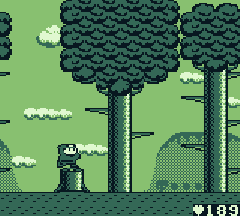
That’s Maru the ninja, standing on the tree stump. As you can see, the tree stump is a solid object acting as a platform. Maru can stand on it and, when he walks into either side, Maru will stop in his tracks. So what about the large tree trunk to Maru’s right? It’s using the exact same repeatable graphic as the tree stump so, logic would imply, the tree’s trunk would also be solid, right? Well, no. Not in this case. That tree is, in fact, a background element. The tree trunk looks similar but is functionally dissimilar to the tree stump, and that just doesn’t make much sense!
What we have here is a readability problem. In other words, a visual element is not clearly distinguishable relative to another visual element.
This is just the tip of the iceberg with this particular game’s readability issues. When Maru steps in front of the tree for example, his body is a similar tone to that of its trunk, making it very difficult to see him as he passes in front of it. The enemies have similar issues as well, making them hard to see at times. And shifting the color of the sky towards the lighter end of the spectrum would certainly improve readability too.
Now let’s take a look at a game that is an example of excellent readability:
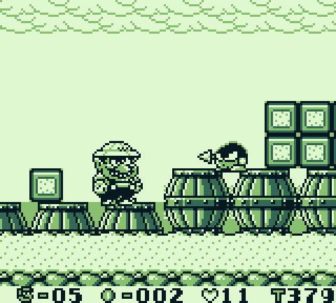
What is and isn’t a solid surface is so much more clear here, isn’t it!
So what exactly makes Maru’s Mission so disastrously unreadable while Wario Land’s graphics make it clear what is going on at a single quick glance? Well, while it’s true that the latter certainly has a more aesthetically pleasing art style, pixel art skills don’t actually enter into it. What’s important here is the artist’s understanding of tone.
Even the most beautiful pixel art assets will lead to a frustrating player experience if tone is not properly managed during art asset design. So even if you feel your artistic talents are lacking, don’t fret! As long as you have a handle on tonal differences from one game element to the next, the end result will work out just fine. Let’s explore tone, one of the pillars of art, and what it means within the context of game design.
Tone is a measure of the lightness or darkness of a particular color. For games developed specifically for the DMG, this aspect of decision making is greatly simplified for us, as there are only four tones of a single color to choose from!

Whether you are creating an RPG, puzzle game, platformer or otherwise, making sure the elements that make up your game are visually distinguishable from one another is a must if the player is going to be able to navigate the games space easily and without confusion. The areas in which the player can move freely and the adjacent areas that are impassable (like a solid wall for example) are best separated visually by creating a strong contrast between two tones. This goes for separating interactable objects/NPCs or enemies too. When we are talking about separating elements visually and managing readability using tonal differences, what we are really getting at is this:
Creating high contrasts between one element and another makes information clear and easily readable.
One way to test whether one area of the screen (for example, the background layer) is contrasted appropriately against another area of the screen (for example, the platforms on which a player can stand) is by conducting a squint test.
The Squint Test process is as follows:
- Design your background art tile set, enemies, interactable objects etc.
- Lay them out in one single image so that it acts as a mock-up of a potential level.
- Squint your eyes until most of the detail is lost, and all that is left is a vague suggestion of light and dark areas.
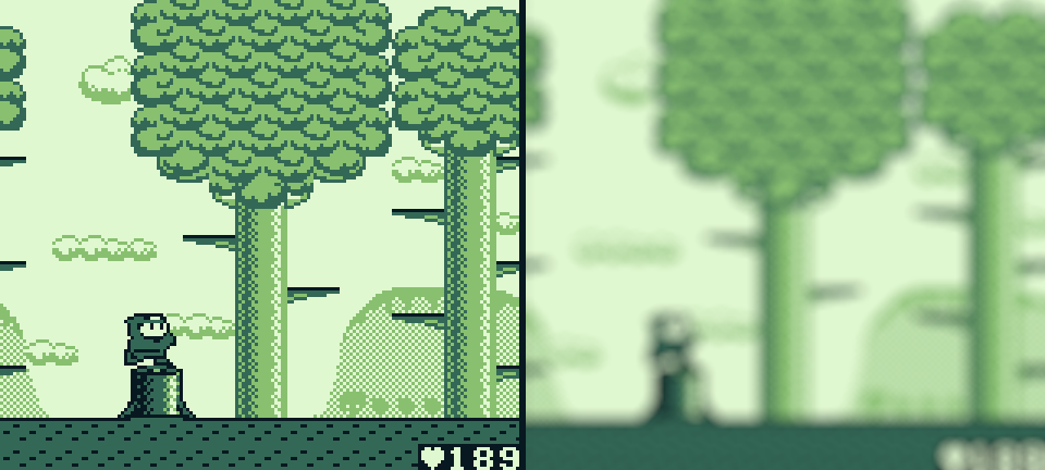
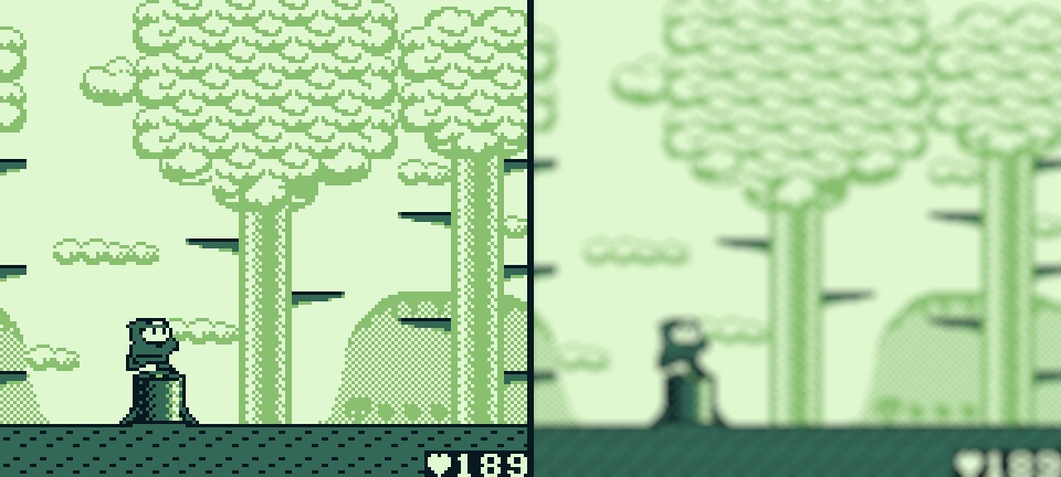
By doing this, you can assess whether your art assets are easily readable in relation to one another without the details of the scene clouding your judgment. To simulate this, we can blur the two examples from above. (Blurring the image using software is another fine option if you would prefer not to squint.)
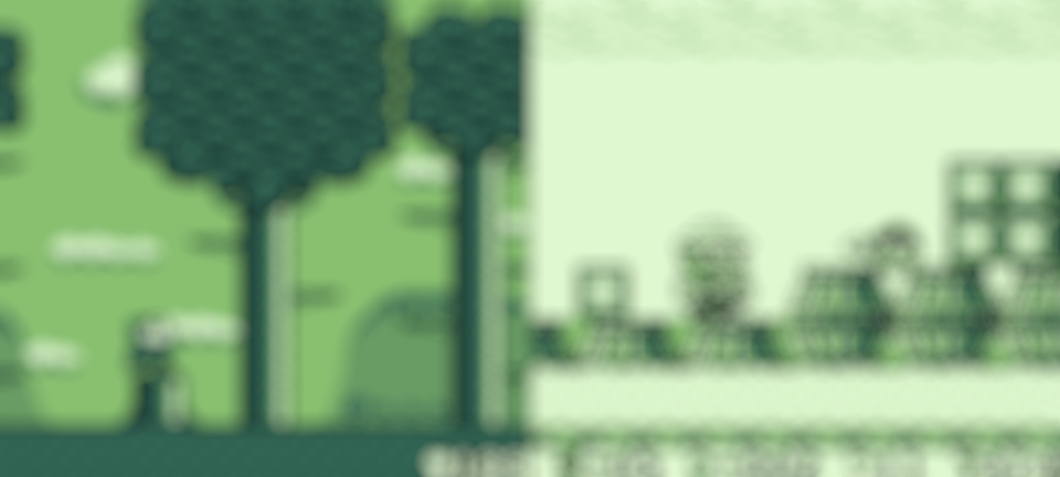
By removing most of the detail in the image and focusing solely on areas of tonal contrast, we eliminate the rational part of our brain that attempts to contextualize the space beyond simple light and dark spaces. For example, if we focus on the blurred image of Maru’s Mission, we can see there is a very dark vertical line that acts to ‘block’ the path forward from left to right. We know that, when the image isn’t blurred, that is a tree. And if we were to play the game, our brain would get to work on it. It would say to itself: “Hey, I know that tree trunk is dark just like the stump and, although the stump is a solid platform, the tree trunk is just a tree in the background. Therefore, I can walk past it.”
But here’s the rub, that thought process takes time – even if it’s just a millisecond. The brain is very good at making sense of things and it makes sense of the game’s landscape eventually but, when we are in the heat of the moment (and certainly when playing an action platformer), that’s milliseconds of time wasted when the brain should be focusing on more important game play elements. You know, things like judging the trajectory of an oncoming projectile or where the player character is going to land when jumping. Time spent making sense of a background element might mean the difference between reaching a win state or a fail state so it’s up to the developer to make sure the visual information available to the player is as clear as possible at a glance!
The “at a glance” part is really important. If the player can make sense of the playable space within a scene almost instantaneously, then you will have succeeded in solving the readability problem. Wario Land is always making sure the background has high tonal contrast relative to its platforms, collectables and enemies and the end result is, well… one of the best games on the system!
Let’s apply what we have learned so far to the Maru’s Mission scene and see if we can “fix it”, so to speak. Here is the original, in all it’s unreadable glory:
Next, we have the same scene but I have shifted the tone of the background elements to a lighter color, creating a relatively higher contrast between what is a solid surface and what is not:
Notice I have left a black line on the top surface of the tree branches. They are one-way platforms that the player can land on, so I have attempted to convey their similar function to the ground platform by having them retain their dark tone. Furthermore, the sky and distant mountains in the background have been shifted to a lighter tone as well, which helps create a high contrast between the empty space and the solid ground.
Lastly, if we want to push the contrast as much as possible, we can shift the tone as follows:
Using the Squint Test, it’s certainly clear what is and isn’t solid now – especially at a glance!
In addition to sorting out our readability problems, changing the tone in this way has also conveyed a sense of receding dimension too. Particularly in the first iteration, the background elements have been separated to create a foreground with the player character, tree stump and ground, a mid-ground with the trees and a background with the clouds and mountains off in the distance. So tonal variation can also do more than simply make the game play more readable.
This exercise has made one thing abundantly clear; Just because something is dark (or light) in the real world, doesn’t mean it should be the same when recreated in a game. I can imagine the artist that worked on Maru’s Mission may have had a thought process akin to the following:
“Tree trunks are dark brown, so therefore the tree trunks in the game will need to be a dark color. And certainly, since I’m making the tree stump dark green, the trees need to be dark too because they are made of the same stuff!”
This kind of logic is appropriate for realism within the realm of fine art. But when applied to artwork in video games, true likeness can often get in the way of how the player interprets the moment to moment game play. Ultimately, readability should always trump realism when it comes to designing visual game elements. Otherwise, there is a risk the game will become very confusing for the player – and they may not even be able to put their finger on why at times. Confusion leads to frustration, which leads to drop off or even the dreaded rage quit … and we certainly don’t want that for the player!
Before we finish up, there is one more way to use strong tonal contrasts to our advantage that I’d like to briefly touch on. Whether it’s a player character or enemy in a platformer, or an important item or object the player needs to interact with in an RPG, creating a bold line around the point of interest will increase readability drastically and direct the players attention towards what is pertinent to game play. A bold line can mean a black line against a white background, or a white line against black background, or just a relatively thick line of any tone. On the flip-side, just as elements with a lower detail don’t grab our attention relative to those with lots of detail, likewise, by reducing the contrast of art elements within the background layer that are not important to the game play, but serve only as “set dressing”, we can lower their visibility too.

The coconuts featured in Link’s Awakening are a solid obstacle so feature a black outline to indicate this. The seashells in the sand on the other hand, serve as background detail only. They are “pushed back” into the background by only utilizing the three lighter tones and omitting black all together. In fact, this scene is a prime example of all we have discussed in this article. All the interactable objects and solid barriers use a black line and relatively dark tones to separate the non-playable space from the playable space (which itself only uses the two lighter tones available). The eye is drawn to the detailed, high contrasted treasure chest in the top right. And the camera stays put while the player navigates the space, only shifting to a new view when moving to a new map screen. Great stuff from Nintendo’s Research and Development No. 4 department, as always!
In Part 2, we will continue looking at the issue of readability. Specifically, we will explore how dark tones can negatively impact game play on the dot matrix screens of the DMG and Game Boy Pocket.
Independent Games Designer, Artist, Film Enthusiast and Full-time Dad (he/him). Check out my games here!