The “Reward” scene… one that’s main focus is to excite and reward the player for completing some insurmountable challenge and serve up a dopamine hit for their trouble. That’s what this article is all about!
Considering this tutorial will entail sharing some of my own techniques when putting together a more visually exciting scene in GB Studio, the title is rather egotistical, isn’t it? But I don’t wish this to be an exercise in patting myself on the back though. A “Reward” scene has many uses when it comes to game design and it’s well worth sharing the knowledge I have gained over the last eight months since I started tinkering with GB Studio.
A flashy scene can accomplish a great deal considering it has no game play in it:
- It can reward the player for their hard work – pushing them to continue playing.
- It can allow the artist in you to break away from the common 8×8 pixel tiled grid for a change, and push the limits of the 192 unique tile limit (256 if you don’t need to use a dialogue box in the scene). So that translates to lots of curved and diagonal lines, unique character designs and larger than life artwork – which really sets a game apart when you consider just how blocky a typical game play scene is by virtue of it being a Game Boy game.
- It can be used to market your game online! A screenshot of some elaborate artwork such as a splash screen or cut-scene etc, not only looks great, it can often be viewed out of context and without a long winded explanation, so someone scrolling through their social media feed will more easily be able to process a flashy image over some complex show of game play.
- Sometimes it’s just lots of fun letting your artistic side off the leash to go nuts!
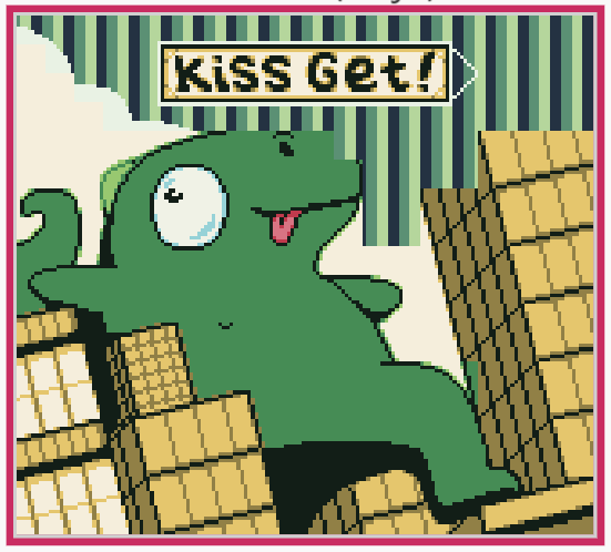
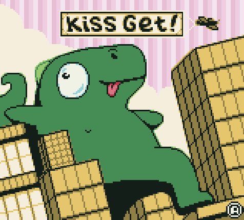
It should be said that the techniques shown within this article are specifically for use with color mode and will force players to use the GBC, GBA or similar color enabled devices. With all that said however, I’d like to share with you a scene from my GBC game “CUPID” and explain the techniques I have utilized when putting it all together:
There is a lot going on here but if we take it slowly, you will find that much is possible with a bit of planning.
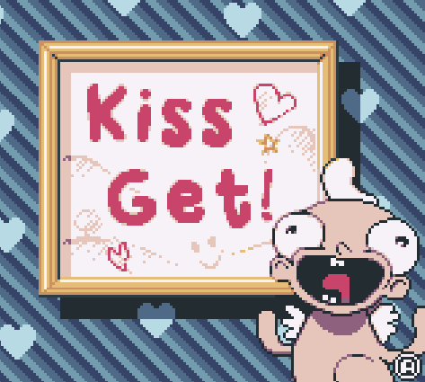
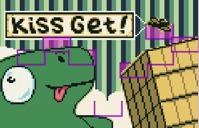
First off, let’s take a look at the raw PNG file that will be inserted into our GB Studio scene:
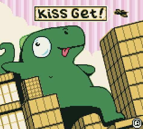
Hmm, looks quite different doesn’t it? There is lots of visual nonsense all over the place. At this point, the image doesn’t make much sense – but with some clever use of palette and actor setup, we can make all of this come together. Let’s take a look at the same image but this time, I will overlay an 8×8 pixel grid to better explain what is going on here:
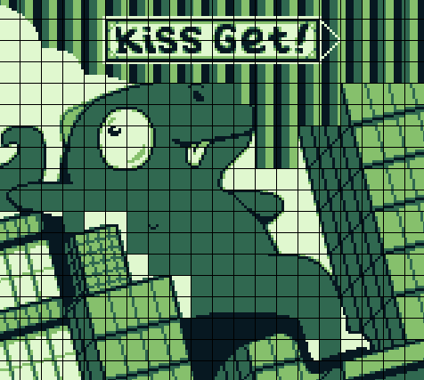
The main points to look at here are the areas in which the buildings meet the kaiju to the lower left, where the buildings meet the sky in the top right, and where the kaiju’s head meets the sky. These areas have been edited to fit in with the 8×8 pixel tile coloring functions of GB Studio, drastically altering or cutting much of the image out. But don’t worry, this is all according to plan. I will explain exactly what these setups will achieve.
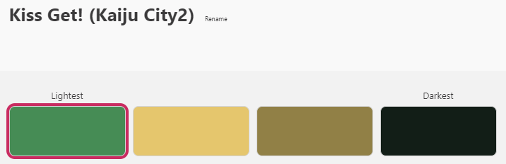
Planning during the drawing of the art asset phase is essential here but before we go into detail, we need to pick a palette for the overall image. Something that will feel balanced and aesthetically pleasing. To do that, I will head to Adobe Color, a website built for creating palettes quickly. Since I want my Kaiju to be green, I will use that as the basis for the overall palette selection.
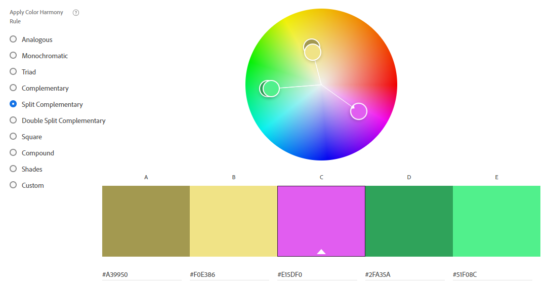
I have picked a split complementary palette that tells me it’s a good idea to put yellow and pink hues with the green. You can choose any kind of palette you like but I appreciate how this particular split complementary palette offers a “feel good” bright and bubbly vibe. So let’s go with that! (I’m not picking these exact colors, I just want to get a basic idea of where I’m going at this point – green, yellow and pink!)
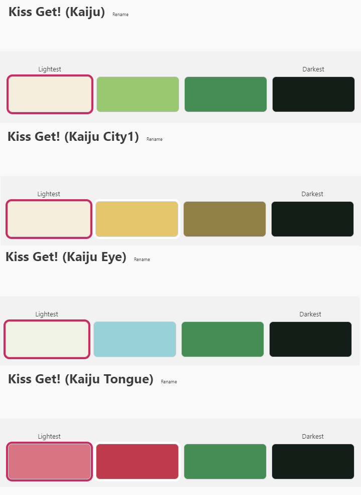
Basic Palettes
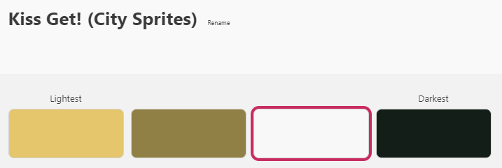
Now that we have a good idea of what colors we are going to use overall, let’s tackle the easiest aspect of the image first. We can start laying a couple of basic palettes down immediately without fuss. Namely, those relating to most of the Kaiju, buildings and the ‘Kiss Get!’ text. Here are the four palettes I have constructed:
Now all we need to do is start assigning the correct palette to the correct tile.

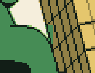
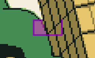
Much better! But now we must deal with the tiles where the buildings meet the Kaiju. These tiles will ultimately share the same yellow and green colors but applying the basic palettes will result in a nonsensical final image. To correct this, we can use a split palette.
Split Palettes
Going back to the background PNG image, you can see I have colored some of the Kaiju white, instead of the dark green tone. This is because I don’t want the dark green tone of the kaiju to be assigned the same color as the dark green tone of the nearby buildings when painting the scene.
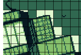
It’s important to note that I have purposefully made the building a darker tone in order to make sure the white is not shared on these building tiles – otherwise this technique will not work! By assigning two separate palettes to the kaiju, we can “trick” the Game Boy into showing more than 4 colors in close proximity to each other. So the next palette I am going to create will help make sense of where the kaiju and the buildings meet. All I need to do is use the same color palette as the buildings but swap out the white for the green kaiju color:
And with it assigned:
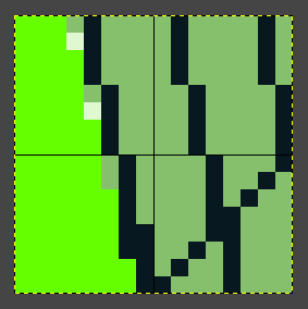
That looks better! But you can see there is one area towards the bottom right that still doesn’t make sense…
Here we have a section where the white tone is already being used for the dust cloud behind the kaiju. So our split palette will also color that portion of the cloud green if we were to apply it to these tiles… Sure, I could make another split palette to make sense of this but because we have limited background palettes, I’ll need to use another technique. That way, we won’t run short of palettes in the long run!
Actor Masks
Another technique we can use to fix this area is actor masks. By creating a sprite and layering it over the background image, we will be able to add the necessary colors in time:
The fluorescent green will translate to transparency and the background colors will show up behind the Actor Mask. We then assign a new palette that omits the dark green tone as this will be created for use with a sprite:
The end result is the seamless meeting of 6 colors across a single tile.
This same technique can be applied to the rest of the scene. Of course, we must be careful to work within the limitations. Depending on what version of GB Studio you are using, the amount of actors in your scene must be considered and furthermore, can’t have more than the equivalent of 5 16×16 pixel actors running horizontally. I say equivalent because in GBS3.0, you may want to use larger actors. Any more than that and the extra actors won’t render -again, this must all be considered in the planning stages.
We are nearly there! Just one more thing to take care of and this scene will be complete.
Animated Backgrounds
In the future, we’ll detail how to cycle background tiles in GB Studio 3.0 with GBVM, but for simplicity, and to be compatible with GB Studio 2.0 (which I used to make CUPID so far), we can rely on the palette swapping technique as detailed in this great article by Dan Enders (LazyDev).
Any form of animation will turn a static scene into something special but animated backgrounds really pack a punch when you want to give the player a reward! In this case, I want to not only do just that, but also give a sense that the plane is traveling through the sky by creating movement from right to left behind it.
I will be using the black, dark green and light green tones to cover the animation. Each will be set to a different color using the [Set Background Palette] event to create the illusion of movement. The white tone will be left white throughout each of the three palettes as it will be used to color the surrounding clouds and doesn’t require animating.
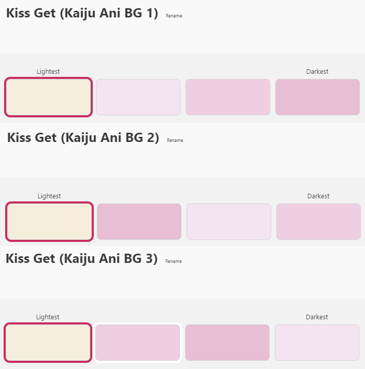
Here are the three palettes I will be using:
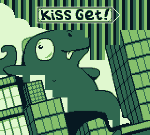
Using the knowledge gained from LazyDev’s article, we can turn this scene:
Into this:
These scenes can take a bit of time and require a considerable amount of planning (and even more time spent pushing pixels around to make sure it’s all going to work) but putting these scenes together can also be very rewarding in their own right.
The techniques discussed here can have a wide range of applications when trying to get the most out of a colored scene and need not apply just to splash screens and cut-scenes. If you have extra actors available to you in game play scenes, why not go to town and squeeze the most out of GB Studio’s limitations by applying split palettes and actor masks to areas that could use some more jazzing up! Even animated backgrounds can be an effective way of directing the player’s attention to something in the right circumstance. In any case, start small if a large splash screen feels all too overwhelming. You can always try your hand at using these techniques on a smaller scale – try applying a 16×16 pixel actor mask over 4 tiles to start and go from there!
What will you make with these techniques? Why not give it a go and share your work with us on Twitter!
Independent Games Designer, Artist, Film Enthusiast and Full-time Dad (he/him). Check out my games here!