
I wanted to talk about something that I thought was kinda interesting, sprite styles; how sprites look and are perceived in their respective games. I think this is a good topic to bring up, since certain GBS games seem to go for sprites without outlines as opposed to using them, like most other Game Boy games. It might not sound deep, but there are a lot of nuances, so let’s talk about it.
Background
We could use some background, so let’s start with a similar console to the Game Boy: the NES. Released as the Famicom in 1983 in Japan, and as the Nintendo Entertainment System in 1985 in North America, this console was made to be inexpensive but powerful. Inside there’s a chip that handles video: the PPU (Picture Processing Unit). For the time it was relatively powerful, but we’re talking early 80’s hardware so there were limitations. The one we’ll focus on for this article is color. The NES graphics could only support 4 colors per tile.
Character designs often had the problem of being too colorful, so developers had to find a way to draw them without losing too much detail. Since one color was used for transparency most of the time, there were truly only 3 colors to play with, so programmers tried to use them as much as possible. This is very visible in early NES titles:
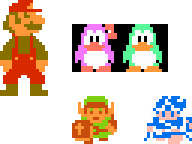
Note: the transparent color in the penguins is the same as the bg.
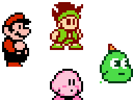
Three colors: for human characters it was usually one skin color, one main color and one secondary color. This worked well for backgrounds with distinct enough colors, and the CRT televisions that were designed for could display them with no problem. However towards the end of the NES era, a new style emerged. This technique favoured one of the colors to use as an outline, which visually left the characters looking like they had two colors:
This new sprite style coincided with the release of the original Game Boy in 1989, which featured a monochrome, 4 tone LCD screen. Compared to the CRTs the NES used, this new screen was very different, it had a lot of quirks, which meant it was time to…
Choose a Sprite Style
The screen on the Game Boy was terrible: it was slow, hard to see, and the default color was white instead of the usual black, so games on it had to look a little different to their console counterparts. Also there was only one color, an ugly yellowish green. No fancy bright distinct colors like the NES. This meant that out of the two sprite styles that appeared on the NES, using outlines made the most sense. The terrible screen forced developers to make graphics as visible as possible, and since there were no colors, the disadvantage of not having a third color wasn’t as bad. This became a very popular style amongst Game Boy games released.
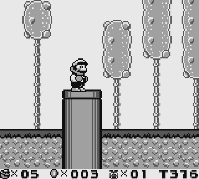
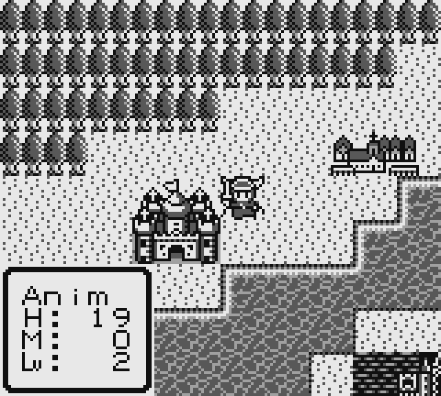
Super Mario Land 2, Dragon Warrior I&II and Pokémon Gold/Silver, all examples of games with outlines.
Later, better models of the Game Boy would be released, such as the Pocket, the Light, and the one we’ll discuss next, the Game Boy Color.
The Outlineless Sprites Strike Again! …sorta
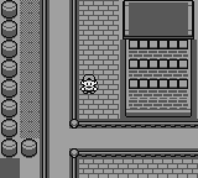
The Game Boy Color, released in 1998, featured a color screen with reduced ghosting which afforded much better quality than previous models. This allowed graphics closer to the quality of the NES, with similar limitations too: 4 colors per palette, although you now had 8 palettes for sprites. This allowed developers to… stop using outlines? Not many games did this, mainly because using outlines was an already adopted and perfected style, but they did exist.
With the improvements in technology, outlineless sprites became less favoured. Outlines did look nicer on a smaller screen but with a wider palette of colors available, they remained an “NES thing”.
Modern Homebrew and DMG
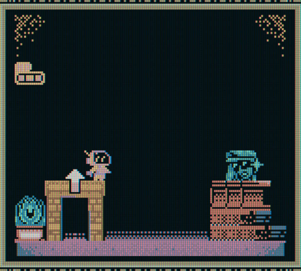
In modern Game Boy development, we can test styles and different device looks through emulators. Let’s begin with one modern (upcoming) game that features outlines, Fields of Eutomia. I’m using shaders to emulate the DMG and CGB screens on RetroArch. Not quite the same thing, but it gets pretty close to the real deal!
This is not a particularly busy scene, but you can see how the black outline helps distinguish the skin of the player from the lightish background. It stands out, although this depends on the style of the environments. A style different to the background can help with readability, but be careful not to make it too different, that’ll hurt consistency.
The next game I’ll show is Zirconia, a platformer by SpicyFuse. You can play it here. This game decided to go with the outlineless approach while also being compatible with DMG.
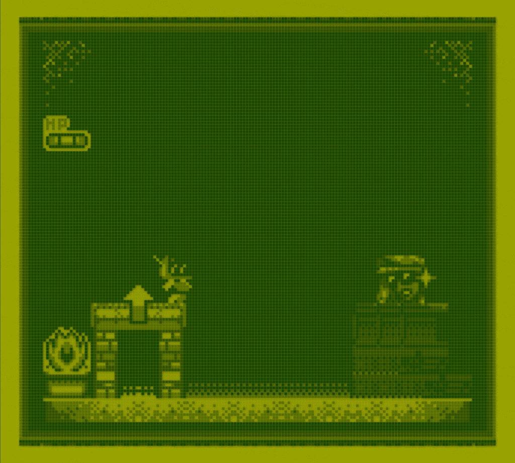
As you can see, black is used for the gloves, bottom & outline of the helmet, and is colored purple on GBC. Since the backgrounds of the game are mostly black, these parts are not usually visible on DMG. This is a good example on how to design sprites if you decide to go outlineless, make the less important parts the ones you’ll see less.
Now that you have some ideas about graphics, what will you choose? Outlineless might be more risky, but it also looks more unique. The early NES style might be just as charming as that which came after it. But that’s just one opinion, what are your thoughts?

a/k/a “Anima” – Game Developer Wannabe, Average Internet Enjoyer, Human Being. (he/him)