From Steps to Color Ramp
In Part 1 of this article, we learned how to create a step ramp from one color to another. Let’s keep expanding our four steps into an expansive color ramp that incorporates multiple colors. This way, we can include some reds and browns and assign them to the tree’s trunk and the flowers.
Creating a color ramp can take a lot of work. Shifting colors around takes time and there is often a considerable amount of further nudging once you start testing out the ramp and realize some colors just aren’t working well enough to support others. But it’s all worth it! Because once you have a master palette in the form of an interconnected color ramp, it acts as an easy to use guide when creating any number of palettes within GB Studio for your own game.
To start, let’s pick one of the four colors, and start extrapolating from there. We could pick the dark green-blue color and shift towards a lighter red, passing through various blues and purples, for example. Or we could start from the yellow and shift through to orange and then red and so on. When building your own, you can do whatever feels right for you but for now, let’s start stepping to red from our yellow color.

I have used the same rules described in Part 1, shifting the value to a darker tone as well as shifting the hue towards red as I go, being careful not to create too small or large a step. Now it’s a simple matter of repeating the process, picking an existing light color and shifting it towards a new dark color or vice versa.
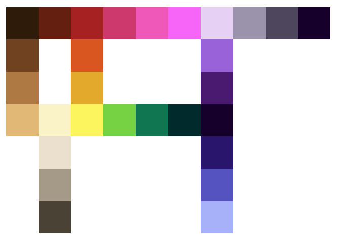
Now we are getting somewhere! This color ramp features a wide range of hues and all the steps are designed to shift gradually from one to the next. You can see that I could select any four linked steps here and insert them into a GBS palette to paint a tile or a sprite in-game with ease. Notice there are three branching ramps, one for blue colors and two gray ramps (one warm and one cool). Our yellow to red ramp is now a color bridge, and there is a large color loop making a circle across the ramp. We have just made a huge leap in complexity here, so I’ll take this moment to break down what I did in a little more detail.
Using Image Editing Software Outside of GBS
Personally, I find it easier to make a ramp outside of GBS using GIMP (or a similar image editing software). The color picker tool in an image editor is not only a relatively quick and painless way to nudge colors around but also visualize how far away each step is in terms of hue, value, or saturation. Here are are some snapshots of some of the steps within our color ramp as an example:
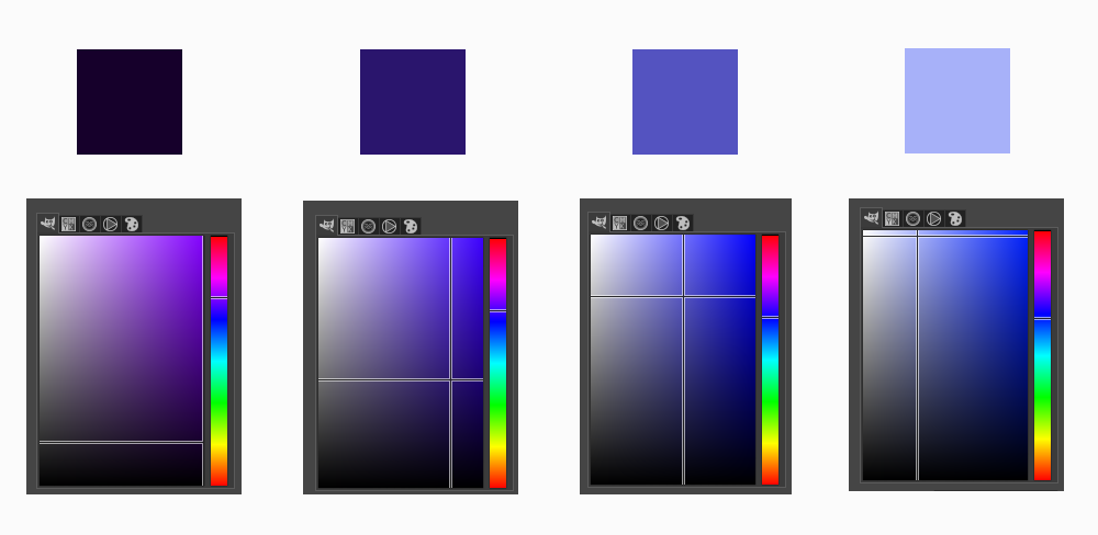
In the above example, I’ve shifted the dark purple towards a cool light blue by doing the following:
- Increasing the value upwards, making the color more bright.
- Decreasing the saturation slightly, making the color more “white”.
- Shifting the hue down away from red and towards blue.
Take a moment to study the image below to see how the three points above can be translated visually using the color picker of your chosen image editing software:
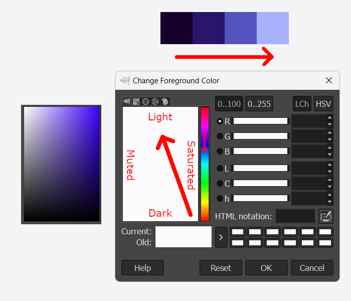
As you can see, our four-color blue ramp is following the red directional arrows as indicated above. If we were to measure the difference between values from step to step, you will find that each is around the same. This will ensure each color steps up or down uniformly across the ramp. The same is true for the hue and saturation. In essence, you are looking to draw a straight line from the darkest color to the lightest color as you shift from light to dark and through the hue spectrum.
How complex and interconnected a matrix of colors you want to create is entirely up to you. This color ramp may seem like quite a leap forward in complexity (and to be honest, it is), but the process is exactly the same as our initial four-step ramp from yellow to a dark green. The more you practice, the more comfortable you will become expanding a palette’s complexity.
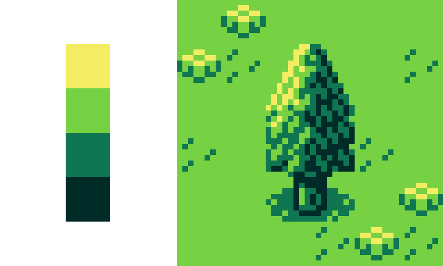
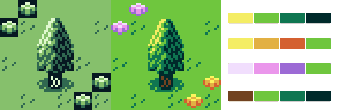
Now it’s time to test our colors by painting our tree GFX. In this way, we can figure out if any of our selected colors aren’t quite working to support the overall palette.
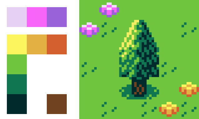
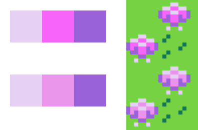
I’ve picked a few linked steps to color the trunk in brown and the flowers using some pink and orange colors. If we draw our attention to the pink flowers though, I think we could work on improving that strong pink color of the petals so that the flower isn’t “jumping out” at us so much. I’ve purposefully made this pink all together too intense compared to the more muted highlight of the flower’s top surface to illustrate an important point when creating a cohesive range of colors. And that is; manage your saturation or the level of intensity of colors.
Saturation
Dealing with changes in saturation levels across a palette is perhaps the most difficult parameter to get right, at least in my opinion. Having said that, there is nothing wrong with changing the saturation of colors across a palette, in fact it’s necessary to mute various colors and arrive at much needed gray scales or whiter variants of a color. At the same time, saturation contrasts can also be incredibly nuanced and difficult to get right! Let’s return to the work of John Singer Sargent just to show you how effective creating a high saturation contrast between elements in a piece of art can be.
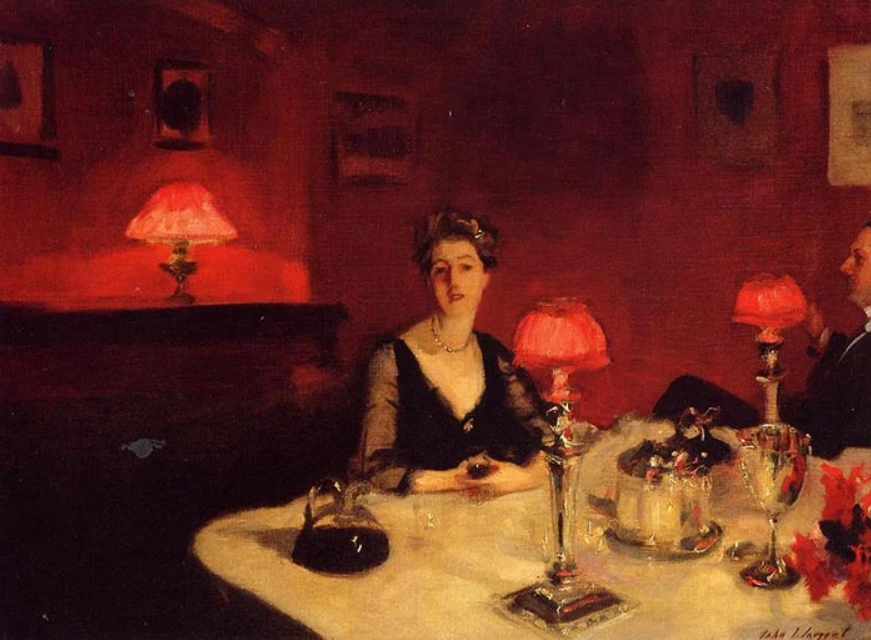
In A Dinner Table at Night, the vivid reds of the lamp shades and surrounding light are used to direct the viewer’s attention to the female figure in the center of the painting. The rest of the colors are muted variations of blacks, grays, and yellows relative to the red. It is the contrast in color saturation that makes this piece such an effective use of color.
In the context of game design, saturation contrasts can be used not only to create interesting static screens for cutscenes or menus, but also as a way to differentiate art elements to support the gameplay itself. For example, using muted colors can push background art further into the background, while using saturated colors will pull an art element into the foreground. As seen in the screenshot below, this can be used to improve readability and create a sense of receding dimension to a game’s scene.
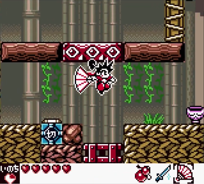
As you can see, creating a strong saturation contrast within a scene can lead to great results. It can be a highly effective weapon in your game design arsenal, but if you are unsure about how to deal with saturation levels across a palette and want to keep things relatively simple as you learn, then I offer this advice to you:
Stick with a similar amount of saturation across a color ramp.
So if your game is designed to appeal to kids (or the kid in all of us), with the exception of shifting towards grays, keep the saturation of your color ramp relatively high. If you are going for a more relaxed or adult vibe, then you would ensure your color ramp features some degree of muted colors to support the game’s premise. To reiterate, if you are ever unsure, as long as you don’t start shifting the saturation’s of mid and dark tones all over the place, your palette will work out just fine.
With this in mind, it’s time to nudge some colors in the palette. In particular we need to make sure the step between our flower highlight and the pink petal isn’t too large of a tonal shift both in value and saturation.
We would then make the necessary edits to our master color ramp and continue tweaking and fine tuning it by applying colors to the scenes and art elements in our game, learning more about our palette and its strengths and weaknesses as we go. Now that we have improved our color palette ramp, we can create the necessary palettes in GBS and paint our scene.
Picking a palette, creating a color ramp and fine tuning it can take time and quite a lot of patience. But it can also be a fun way to explore color as well as provide a base for you to come to when coloring your entire game in an effective and cohesive way. If you’ve never tried creating your own color ramp, I hope this article has helped to get you started. Yes, making a palette can seem like a perplexing problem but remember, start small, take your time, experiment and find what works for your own game. With a little practice, you will be creating not only aesthetically pleasing palettes but also palettes that can influence the very experience of the player in a substantial way, and your game will be all the better for it!
Independent Games Designer, Artist, Film Enthusiast and Full-time Dad (he/him). Check out my games here!