A while back, I covered color theory in the context of game design. We explored how palettes can be applied to backgrounds and sprites in order to direct the player’s attention toward points of interest, liven up a scene with analogous colors, and improve readability overall. For the beginner, I suggested simplifying matters using 1-bit or minimal palettes, or by incorporating a pre-made palette into your own game scene.
This article is for those who wish to go beyond the basics of color theory. We’ll explore how to pinpoint a color you want, how to expand on that color to create a palette, and then organize that palette into a useful color ramp which can then be applied to any scene to make a cohesive whole. Before reading on, feel free to take this moment to read my chapter on color theory and refresh yourself on the various color theory terms and definitions that will be used in this article.
Picking A Color
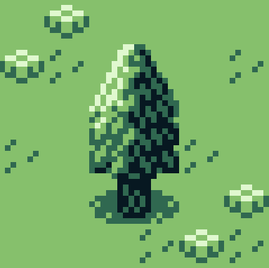
Pick a color, any color. It’s simple, right? Well…of course it is! We just need to know what we are coloring and we’re away. For the purposes of this article, I have drawn a simple tree using the default colors of GB Studio’s .png template.
The first color that comes to mind when I think of a tree is green. But even something as simple as determining the colors of a tree’s leaves can be a loaded question. What if you want to set your game in a season other than spring? Autumn or summer may have you wishing for a rich red or perhaps a dry yellow color. Or what if you want to provide a certain mood or tone that is specific to your game? Maybe you’re making a horror game or some gritty dystopian adventure. Then you may be thinking a lush green color isn’t the best solution. Maybe a dark blue or purple would be better? Or perhaps a green hue shifted toward orange or brown? The color you assign to any element in-game will depend on a number of factors. It’s up to you to determine what colors will best suit whatever mood your game needs, but we will stick with good old green here. Something vibrant and inviting.

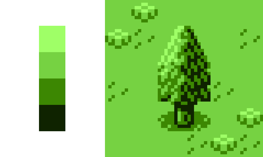
The most direct and simplistic way to extrapolate a palette from this color is to shift its value in both directions until we end up with a light tone, two varying mid tones, and a dark tone of the same hue.

What we have just made is a color ramp made of four colors, each of which we refer to as a step. Here it is applied to the .png file:
Extrapolating Your Steps
Shifting the value has certainly given a sense of depth, but it’s not the most thrilling collection of colors. In fact, it’s not too dissimilar to the original .png we started with! Luckily, value is only one parameter at our disposal when coloring an element. To illustrate just how dynamic an image can get through palette selection alone, we’re going to move out of the realm of pixels and into the world of fine art for a moment. Let’s take a look at a painting by the impressionist John Singer Sargent to show you exactly what I mean.
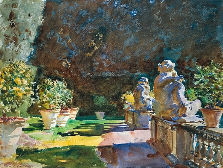
I’ve selected this piece for its striking contrast between highlight and shadow. You can see that the grass is shifted towards varying yellow hues when in direct sunlight while areas of grass in shadow have been heavily shifted in the opposite direction, towards blue. The stone masonry detail and red dirt path have been painted in the same way, mixing to create shades of purple. The end result is a vivid and exciting exploration of light and form.

But how does all this relate to selecting a palette for pixel art, I hear you say? Well, whether creating a digital pixel art tree or using analogue methods, such as with oils, watercolor, or any medium for that matter, hue, saturation and tone are all there to help create the illusion of form, or how light bounces off the surface or transmits through matter. So the same techniques and rules that an oil painter uses to create a palette before laying brush to canvas can be used just as effectively when a GB dev creates several palettes before painting any art element with some form to it. So with that, I’d like to share some rules that I use when not only creating a color ramp to paint a scene in a game but also when mixing my own oil paint palettes.
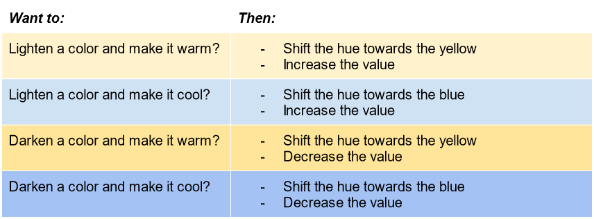
The Rules of Color Shifting
If I had a mid tone red oil paint and wanted to create a highlight from this color, I would choose one of two colored paints to mix in. Firstly, I could choose yellow paint. It brightens the value of the red, and also shifts the hue towards a warm orange color. Or I could use a white paint. This would also increase the red’s value but, this time, I would be shifting its hue towards a more cool color, in other words, blue.
Same again for if I wanted to make the red color darker. I could pick a dark blue, mix it in, and watch the red paint turn to purple, slowly adding more until I get a darker purple and so on until I come to the desired colored paint. I would end up with some variation of a dark shade of cool purple. Or, I could add brown (which is a dark orange color if you want to pinpoint that on a color wheel) and I would end up with a darker warm red shifted towards yellow.
In the context of digital art, shifting hues along a spectrum is akin to mixing in these yellows or whites, or these dark blues or browns into a base colored paint – only you are sliding a toggle on screen rather than physically mixing paint together, obviously. In any case, the same rules apply.
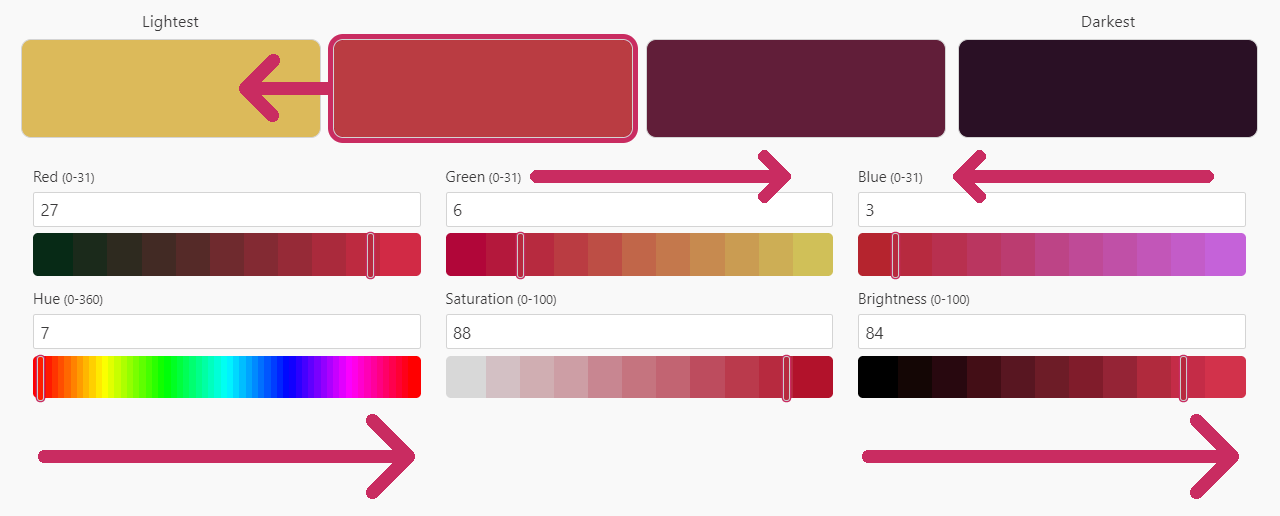
In the above image I shifted the red mid tone color in several ways to arrive at a lighter yellow highlight color. Moving the brightness (value) toggle to the right lightens the color; that’s simple enough. I also started fiddling with the green and blue toggles by shifting them to the right and left respectively. This in turn shifts the hue to the right and towards the yellow area of the hue spectrum. In this way, you can nudge any color you want in any direction you want to suit your needs!
Let’s return to our tree and redo the same four color ramp, this time utilizing the rules above:
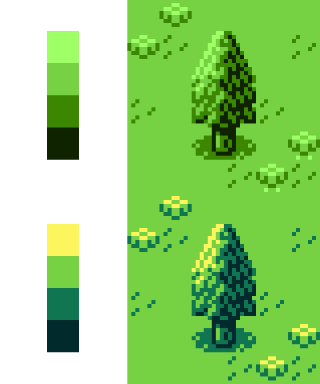
This new palette is a bit more exciting than the original, and I could easily push the hues further apart to make an even more dynamic four-step palette. Experimentation is the name of the game here, try nudging colors in various directions, play with parameters, find out what works and what doesn’t. Even though it seems like palette creation is some magical mystery for the beginner at times (and even for the intermediate), it really is just a matter of practice once you know the rules. Having said that, we aren’t done yet!
In Part 2 of this article, we will expand our four-color palette into a versatile color ramp with multiple colors, branching paths and color bridges. By the end, you will have the knowledge necessary to create a master palette that can color an entire game and ensure the game’s palette is varied while still remaining cohesive as a whole.
Independent Games Designer, Artist, Film Enthusiast and Full-time Dad (he/him). Check out my games here!