
As I already mentioned in the starting article of this series, my reality is a different one than yours, since I have a slight form of dyschromatopsia.
Since it’s very minor, I usually don’t notice the effect of this disability in my daily life, or while gaming, thus I can usually enjoy all games without any problems. Though, other people can have a harder time playing games because of very low vision (even with the use of glasses) caused by several visual impairments, color blindness, or even near-complete or complete blindness, making it a lesser experience.
In this article I want to showcase some solutions to offer better support on your next Game Boy and Game Boy Color game for people with visual impairments.
Of course it’s hard, or for some types of games straight up impossible to consider all of the mentioned methods. Thus the following list is by no means a fixed set of rules to go by with every game you create. But I think raising awareness for this topic is important and it may lead to some sensible design decisions in your future games.
1. High-Contrast Sprite and Background Design
Maximize Contrast: Make sure to use the darkest and lightest colors to differentiate between important game elements (e.g., character sprites vs. background). Prioritize the visibility of interactable objects.
Avoid Busy Backgrounds: Keep backgrounds simple and uncluttered to prevent confusion with key gameplay elements. Use solid colors or simple patterns behind important objects or text to maintain clarity.
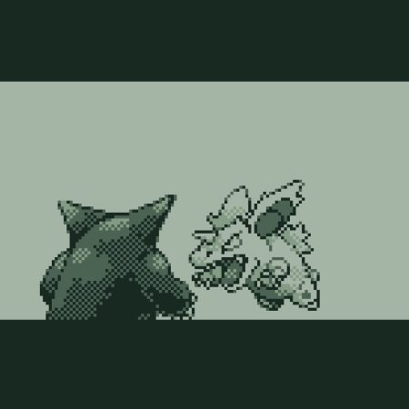
Edge Outlines: Give important sprites (like characters, enemies, items) clear outlines in either black or high-contrast colors on GBC. This helps them stand out against the background.
2. Colorblind-Friendly Design (GBC)
Patterns and Symbols: Since the GBC offers, well, color, ensure critical gameplay elements (such as enemies or items) aren’t solely differentiated by color. Use patterns, shapes, or other visual indicators when possible to make out the difference.
Limited Palette: Choose contrasting color palettes that work well for all players, including those with colorblindness. Test your palette for visibility issues like protanopia or deuteranopia by sticking to universally distinguishable colors (e.g., avoid red-green contrast).
Use tools to check your colors:
3. Sound as Feedback
Audio Cues: Use sound effects and music strategically. Since the Game Boy has no text-to-speech capability, audio feedback becomes crucial. Assign unique sound effects to actions like collecting items, taking damage, or activating switches, so players don’t rely solely on visual feedback.
Interactive Elements: When a player interacts with an object (like a door or switch), provide immediate sound feedback so they know the interaction succeeded.
4. Clear Gameplay Mechanics
Slow-Paced Mechanics: Avoid fast-paced, twitchy gameplay that requires split-second visual responses. Instead, give players more time to react to what’s happening on screen. This helps players with low vision or slower visual processing. The low refresh rate of the original Game Boy with its screen tearing already forces us developers to not go wild with too fast things happening.
Minimal Reliance on Visual Precision: Design levels that do not require pinpoint accuracy. For example, wide hitboxes for characters and objects can ensure that visually impaired players don’t need perfect hand-eye coordination to perform essential actions like jumping or attacking.
Visual Indicators for Game States: When something important happens (e.g., player low on health, level up, or a boss fight is about to start), use both visual and audio signals to make these states noticeable.
5. Text and Dialogue Accessibility / Font Design
Readable Fonts: Avoid using overly stylized fonts that could be hard to discern on the small screen the Game Boy has. Fonts without serifs are usually better to read.
Spacing: Ensure enough spacing between letters and lines of text when choosing or making the font. Crowded text can be difficult to decipher, especially for players with low vision.
Slow Scrolling Text: If you’re using text-based dialogue or storytelling, allow text to appear on screen slowly or give players control over text speed. Players with visual impairments may need more time to read.
Sound Cues for Text: Add an audio cue when new text appears to help visually impaired players keep track of the narrative or important instructions.
6. Menu and UI Design
Simple, Clean Menus: Keep the user interface (UI) and menus straightforward, with large text and distinct icons.
Highlight Selection: Ensure the currently selected menu option is clearly highlighted. Use a bold outline, high-contrast colors, or even a simple animation (like a blinking selection box) to show what is selected.
7. Test on Real Hardware
If possible, playtest on actual hardware. Emulators often display Game Boy graphics and colors in a way that doesn’t reflect how they appear on real hardware, especially in terms of brightness and clarity. Make sure to test your game on a real Game Boy or GBC and other handhelds to ensure that the visuals are clear and readable on all screens.
Verdict
By focusing on these tips you can create a more accessible experience even within the limitations of the Game Boy and Game Boy Color hardware. Playtesting with visually impaired players will also be key to refining your approach and ensuring that your game is enjoyable for a broader audience. On top, many of these tips are actually the base of a good and polished game, so it makes sense to have them in mind anyway.
Let’s try to think outside our own scope and make sure to include more players by designing with accessibility in mind.

Martin first went into making GB Studio games with his playable portfolio of his own personal website. He is generally interested in a very broad band of topics, and adds new things to the skill list all the time. Being born in the late 80s, the original Game Boy DMG-01 was his first gaming console, and so he kind of has a nostalgic romance with everything around it.