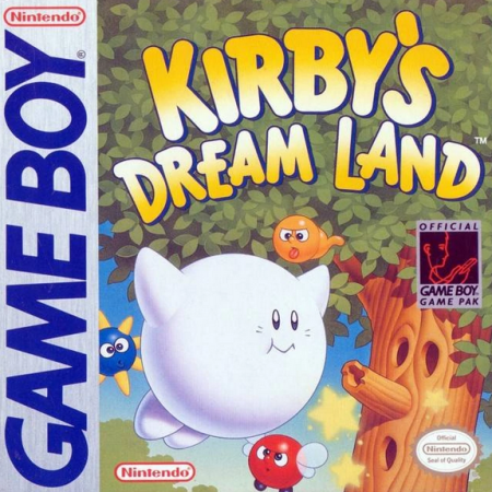
In 1992, Nintendo published the first of many Kirby titles, a series that is still going strong today and loved by many for its delightfully cute aesthetics and soft approach to platforming difficulty. With Kirby’s Dream Land (known in Japan as Kirby of the Stars), Masahiro Sakurai and his expert team of game designers at HAL Laboratory placed accessibility at the forefront of their decision making, and the results are a game, and series more broadly, that can be enjoyed by anyone old enough to hold a Game Boy!
At the time of release, there were many action platformers on the market, both for Game Boy and the NES. The amount of ROM space made it difficult for developers to fit a lot of unique content into the cartridge, and so many game directors decided the best course of action was to make their games perhaps a little too difficult to beat, therefore increasing the lifespan of the game. But while this did indeed add hours of playtime to a game, it also made it unreasonably difficult and ultimately frustrating for beginners to explore these titles (I’m looking at you Probotector).
For Masahiro Sakurai’s debut as a director, the aim was not to create a game that would suit his own standards of difficulty (or even the average gamer’s standards at the time) but to create an action game that newcomers could pick up and enjoy right out of the box. In this article, we will take a look at the design choices made by Sakurai and his team, and discover why this particular game was so successful at skyrocketing accessibility and ease of play into the stars!
Just as in the Super Mario Land series, the first screen is void of any challenges, and allows the player to play with Kirby freely, learning how he jumps, floats, and sucks the surrounding air into his belly.
Furthermore, you will find only one bottomless pit in this first level. As with most pits in platformers, falling into them will lead to instant death but, by design, Sakurai has greatly increased the player’s ability to correct their mistake by giving Kirby the ability to indefinitely fly in the air with the inclusion of the float mechanic (by pressing up on the D-pad). What’s more, this pit is found directly after a high wall that forces the player to discover and utilize Kirby’s float ability, so this safety net is fresh in the player’s mind! The float ability also allows a player to simply fly over any enemy or obstacle that they deem too risky to engage with.
You might be thinking, “but that’s just taking all the fun out of the game!” Sure, for a player that’s familiar with platformers that might be true, but that same player can always choose to engage with any number of enemy layouts, suck them up, and defeat them to increase their score (and the levels often become more vertically driven to incorporate the float mechanic as the game progresses). Ultimately, the brilliance of this design choice is that each player gets to determine what’s too risky for their own sensibilities. The risk-to-reward factor is at full play here! It’s not just the score that is rewarding here too: Kirby’s air suck ability and the subsequent projectile spit is great fun to utilize, and serves as a reward in its own right!
Another design feature that enables high accessibility is the incremental health/damage system. Kirby can withstand six points of damage before a fail state is reached, so the player is allowed to make a considerable amount of mistakes before the game sends them back to a checkpoint. In addition, the levels provide ample opportunity to restock health points along the way, especially in the early game.
The health bar in particular gives the player time to learn the patterns of mini-bosses and bosses while taking a few hits along the way. Without it, a beginner may get frustrated as they learn the ins and outs of the difficulty spikes throughout the game’s progression.
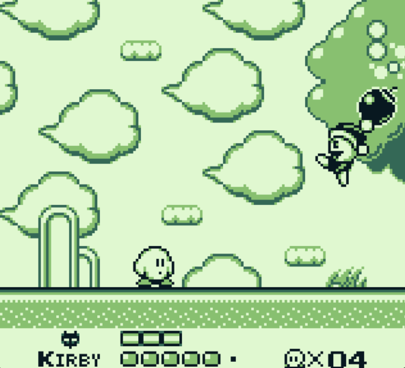
Finally, each level is broken up into smaller chunks, thereby allowing for multiple checkpoints along the way. If a beginner is struggling to master the controls, the game never asks the player to repeat an entire level from scratch when a minor mistake is made (I’m looking at you again, Probotector!) which can get tiresome for even the most veteran platformer fanatics.
So how can we apply some of these design choices to our own games if we too choose to make a highly accessible platformer that puts fun before frustration? Well, it’s easy enough to include lots of checkpoints, a health bar, and loads of health pickups sprinkled throughout the game. But it doesn’t mean every casual platformer needs to have a mechanic that lets the player fly around the screen too. This is a great opportunity to get creative with your solutions. All we need to remember is that we:
- Design mechanics or levels in such a way that the player is never severely punished for making a mistake.
- Allow the player to reverse a mistake whenever possible.
That may mean that the player character is placed in a bubble if they fall into a pit and, rather than being sent back to a checkpoint, they are returned to a nearby platform (as seen in the New Super Mario Bros. series), or the distance between checkpoints are so short and the time taken to retry is so immediate that a death state is barely a punishment at all (as seen in Celeste).
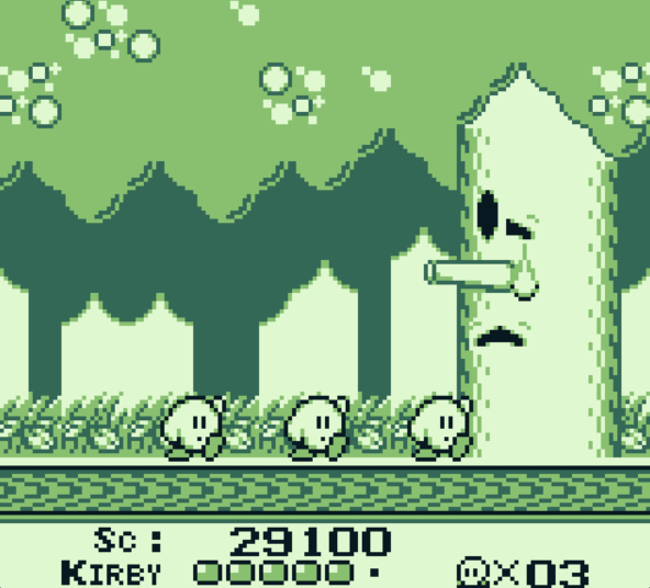
From level intro to chirpy chip-tunes to the finale triple Kirby dance, Kirby’s Dream Land is a delight to play. So much so that many players feel the need to come back and play through it again and again (and some even learn the more challenging speedrun). It is still, to this day, the second highest selling Kirby title of all time (marginally behind the highly acclaimed Kirby and the Forgotten Land)! It just goes to show that maximizing accessibility and going easy on the player can be just as good an option as creating a challenging thrill ride for both the lifespan of a game’s play time as well as increasing the fun factor at large!

Independent Games Designer, Artist, Film Enthusiast and Full-time Dad (he/him). Check out my games here!

