The 1990s were a great time for the platformer genre. With Nintendo’s own Mario franchise blazing a trail of unbridled fun, many developers seized at the opportunity to create a similar run- and-jump action game. For a majority of companies, the most lucrative option was to grab hold of some well-known intellectual property, slap a familiar face on the player character and shovel that shi… I mean… software out to the masses. If the game ended up lacking engaging gameplay, then rest assured some profit could be milked thanks to the goodwill associated with [insert popular toy, tv show or movie here]. Enter the platformer clone. The bane of my and possibly your childhood.
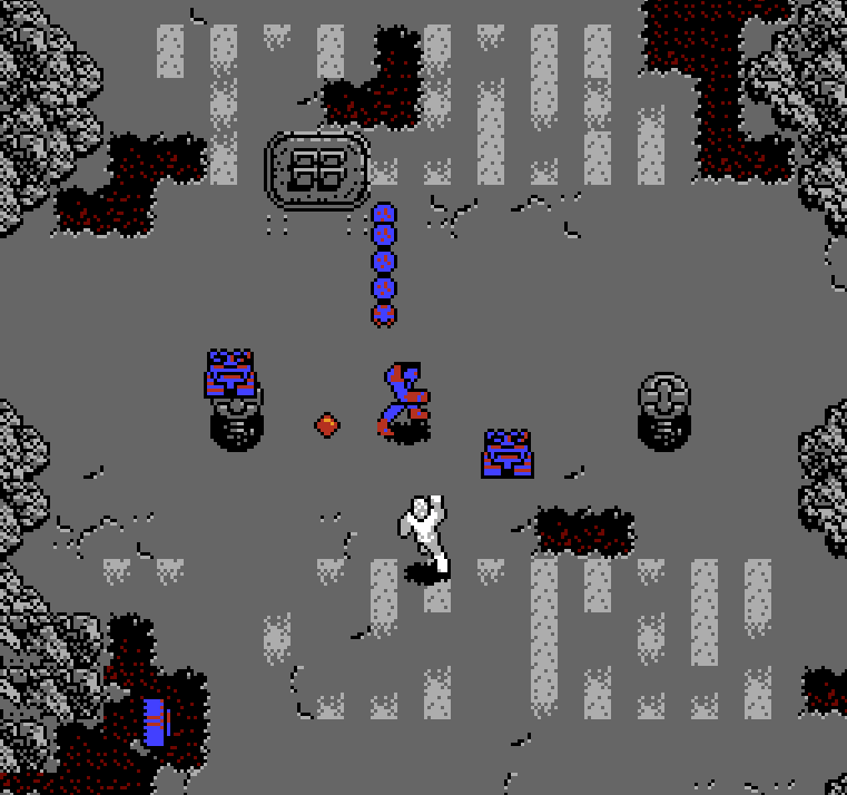
There were a million of these things, with no console left untouched. Don’t get me wrong, some licensed retro platformers were really good and are still a joy to play today. You only need to check out the games from the golden age of the Capcom/Disney partnership such as DuckTales, Chip ‘n Dale: Rescue Rangers, or any one of the Mickey’s Magical Quest titles to know a licensed game does not necessarily equal a bad one. But the truth is, there are a lot of uninspired and forgettable licensed platformers out there. So many, it’s scary!
In the spirit of Halloween and all things spooky, let’s jump into one of these horrors of the Game Boy library and learn a thing or two about the pitfalls of platformer game design while we’re at it!
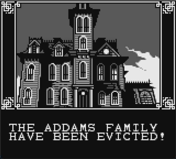
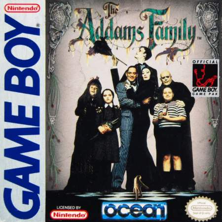
The Addams Family was developed and published for the Game Boy in 1992 by Ocean Software. Gomez Addams must navigate his way through the Addams Mansion and surrounding property in order to locate and save his family members from Abigail Craven, the Judge, and the family attorney Tully Alford, all of whom are after the famous Addams fortune. Acting as a tie-in to the 1991 film, the original concept was that of a puzzle game, however the production took a sharp turn in an attempt to capitalize on the platformer boom of the early 90s when Ocean Software was asked to adapt the film for the SNES in addition to the NES and Game Boy.

As with many tie-ins, time is of the essence if profits are to be maximized, and games that are supposed to go along with a film’s release tend not to be delayed. Even after a monumental shift in production such as changing the very genre of the game mid-development, The Addams Family for both the Game Boy and the NES were not exceptions in this case. It should therefore come as no surprise that these titles sport some considerable design issues due to a rushed development timeline.
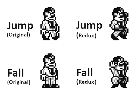
To start, let’s take a look at Gomez Addams, the player character. In particular, I’d like to focus on his metasprite design as he jumps:
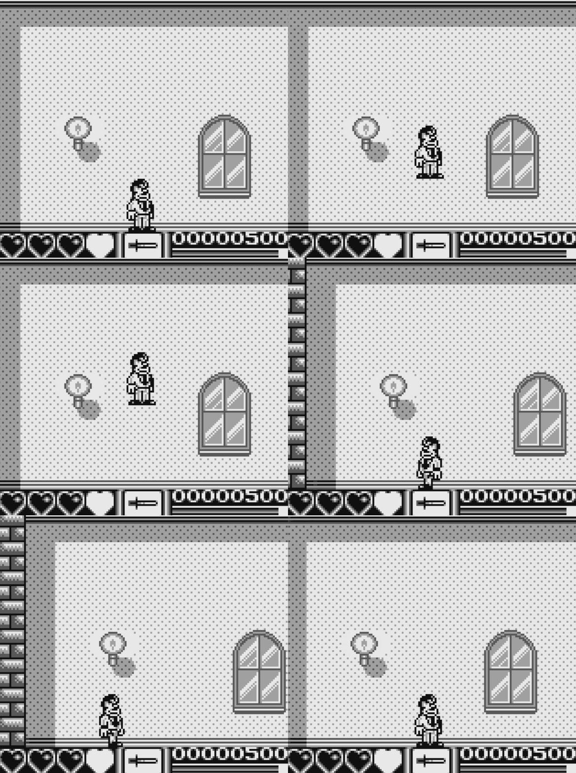
What do you think of this jump animation? Do you think its design reflects the dynamic exertion of a person jumping, or does the jump animation fall flat? Gomez’s arms don’t move and as you have probably picked up by now, his fall state graphics are just the idle sprite, so Gomez’s feet seem like they are constantly standing on something as he falls through the air. I’d have to say, this jump animation feels all together pretty lifeless, doesn’t it?!
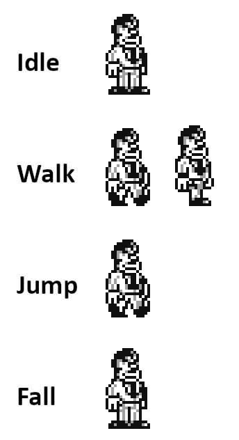
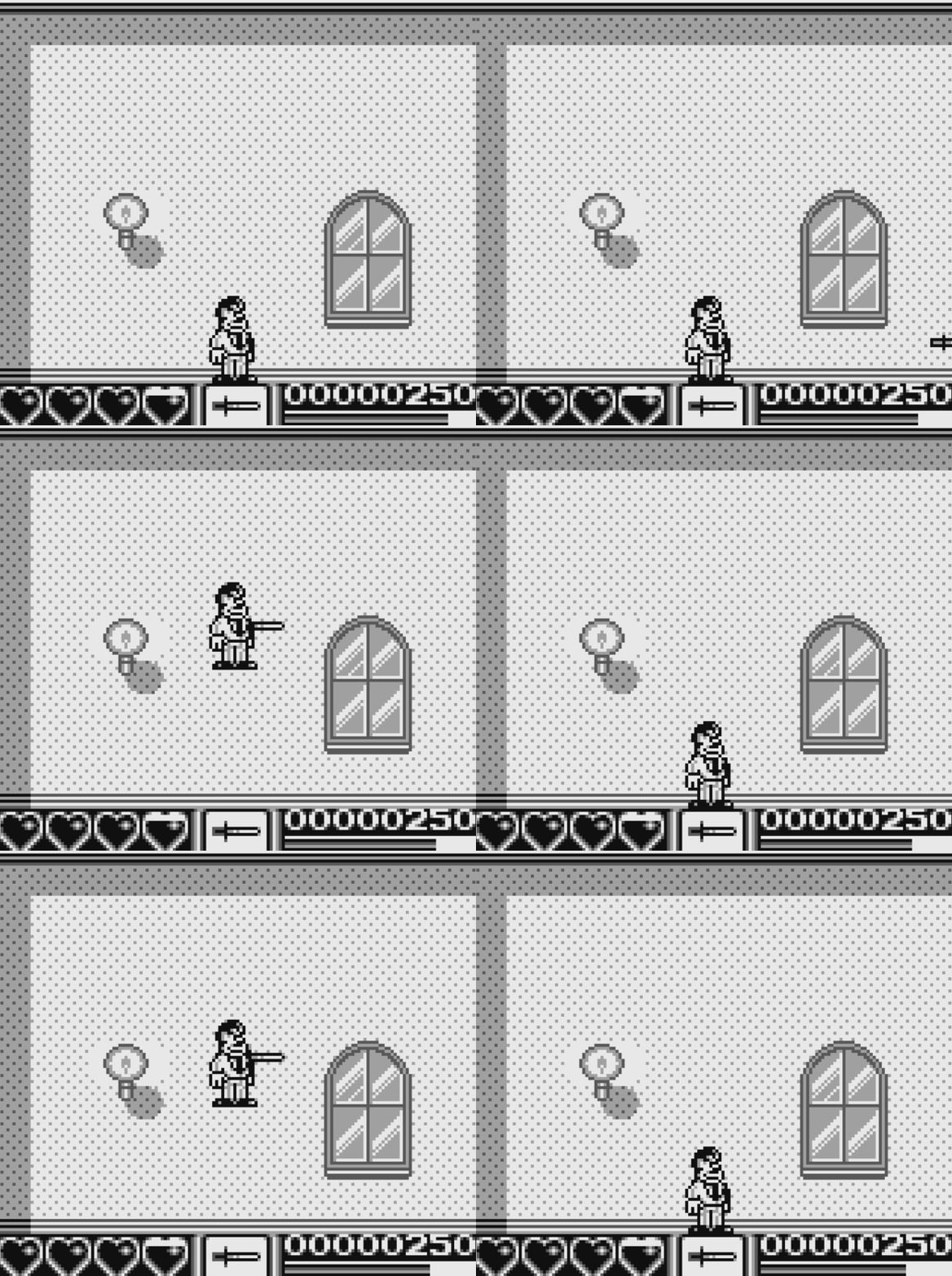
In addition to the idle state being shared with the fall state graphics, the jump state uses one of Gomez’s walk animation frames. When attacking, Gomez’s knife projectile appears out of nowhere without so much as a flick of the wrist, too. It not only looks questionable, it just simply doesn’t feel that good to jump or attack in-game as poor old Game Boy Gomez. But hey, it can certainly be said that the player character’s graphic design is slashing the tiles stored in the Game Boy’s memory! I’m all for creating an economic tileset for a Game Boy game. It’s not only a good idea to cut down on sprites, it’s downright necessary given the hardware limitations. After all, you might be able to put those extra sprites into good use such as implementing an extra enemy, or getting more interesting details into your background graphics. But stripping back the detail on Gomez, the conduit between the player and the game, is probably not the best place to save on precious tile real estate. So, where do you draw the line? The answer to this very much depends on the game, and more specifically, on the genre. Something like a puzzle game, which has slow and considered game play, may not need to sell a moment of dopamine releasing, projectile flinging, hard-hitting action like a platformer does, for example.
For The Addams Family and especially in regard to the all important player character, I’d argue that the animations should be at least a little more dynamic. Let’s explore the possibilities of a new and improved player character tileset in an attempt to reanimate (pun absolutely intended) this somewhat lifeless rendition of Gomez. If we end up adding more sprites to our scene at the cost of other details, that’s okay. It will be worth it! In fact, for the sake of this tutorial, I’ll be pushing the sprite count up considerably, so I can show you a series of tricks I personally use on my own projects.
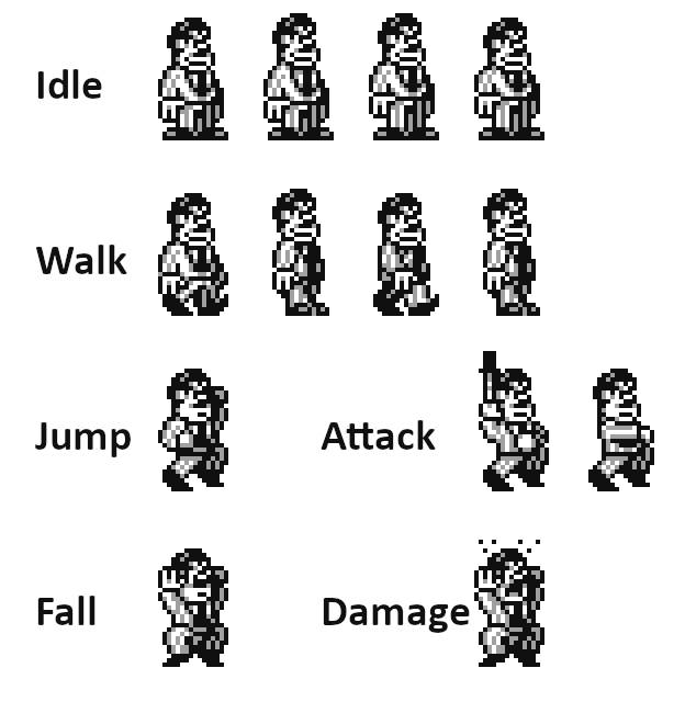
There are a lot of changes in this redux tileset of Gomez. The existing animation frames are heavily edited and we have a couple of new animations as well. I have purposefully retained the likeness of Gomez and the aesthetic of the original artist’s style here, seeking only to make functional changes to the graphics. Let’s go through them one by one so I can explain why I have made each change in more detail.
The Walk Cycle
A major problem to overcome when designing a character’s walk cycle animation at resolutions as small as this, is to ensure each leg or arm makes sense as it passes by the other leg or torso respectively. With so few pixels at our disposal, it can be all too easy to create an image that should look like two legs walking, but ends up resembling a messy array of pixels that don’t look like much of anything. If you take a look at the second walk cycle frame in the original design (see below), you can see Gomez seems to have only one leg. I’m guessing the artist opted to remove a leg entirely so this messy pixel issue wasn’t causing confusion in a readability sense.
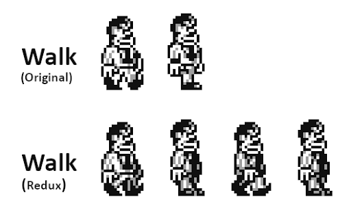
Gomez’s redux walk cycle has been doubled in length, allowing for a more smooth walk animation. I have also given Gomez his left leg back and shaded the left side of his body in the gray midtone. That is, his left leg and left arm are now cast in shadow and relatively darker to his right leg and right arm. This difference in shading helps the human eye to separate the two sides of the character’s body, making it more clear what limb is in front of the other during the animation cycle. No matter how complex the animation is at these very low resolutions, this can be a useful technique that will assist the player’s ability to read the walk cycle as it animates. I have also moved Gomez’s right shoulder forward and decreased the thickness of his silhouette in the second frame to accentuate the twisting motion of his torso as he walks.
The Idle Animation
This is more of an example of how to jazz up an idle animation more than anything else. It’s something I do to my own characters to breathe a little life into an otherwise static idle animation with relative ease but it doesn’t necessarily affect gameplay. Rather, it may improve the player’s aesthetic experience. In any case, this idle animation technique of mine will make any character with a head and torso look like they are breathing using a simple formula.
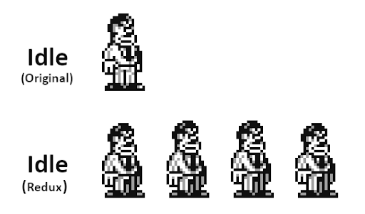
Notice there are four frames in this idle animation and they all look very similar. In each frame however, there has been a one pixel shift up or down to either the head or the torso. Here is the order of body part shifts:
- Head moves up one pixel.
- Torso follows the movement of the head and moves up one pixel.
- Head moves down one pixel.
- Torso follows the movement of the head and moves down one pixel.
In this way, the body parts lead and follow each other rhythmically, making it feel like the character is a living and breathing entity much more than a static pose could ever be. For larger characters you may need to move each element more than one pixel. Remember, any body part (or article of clothing etc.) connected to the torso such as the arms or a jacket will follow the movement of the torso from frame to frame. You could get even more complicated and start shifting other elements of the character around using this lead and follow technique, such as the tip of a long hat or an animal’s tail, for example. A word of warning though, when developing Game Boy games, this level of detail can really eat up sprite usage so it’s definitely to be used with caution! This article may assist further in managing sprite tile counts in this regard and is well worth a read.
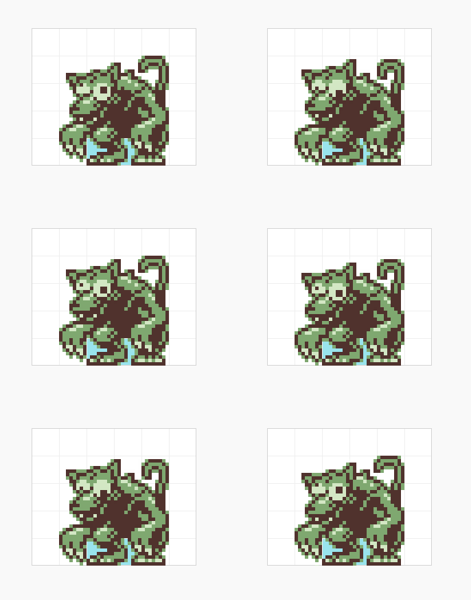
A boss’s idle animation I created for Feed IT Souls (2023). I have used this lead-and-follow technique on the head, torso, and pupils of the boss monster.
The Jump and Fall States
The changes to both the jump and fall animation states are more or less self explanatory here. It’s simply a matter of picking a pose that you think best encapsulates the character’s personality and more importantly, sells the player character’s action effectively. This has less to do with making “beautiful” pixel art and more to do with drawing dynamic effective poses during an animation. Whether it’s Mario’s Looney Tune-esque skidding animation state when you quickly change direction in SMB1 or the anticipation frame of Simon Belmont’s whip attack animation, there are plenty of examples to draw from. For Gomez’s jump frame I picked the classic Super Mario jump pose with the hand up in the air, leading the body’s movement through the jump arc. For Gomez’s fall frame I drew the arms so they follow behind the inertia of the body as it falls, similar to Kirby’s fall animation in Kirby’s Adventure.
What’s important is:
- The graphics convey a strong sense of the player character’s action – in this case the inertia behind jumping and falling
- The silhouette of the character is generally similar in size and shape to the other animation states, ensuring all poses consistently mirror the hitbox of the player character. Doing so will ensure gameplay does not feel unfair if a player fails a challenge during an action.
The Attack State
How to handle the graphics of a player character’s attack state could be a two thousand word article all on its own. For now, I’ll keep it very brief because this article is already getting rather lengthy.
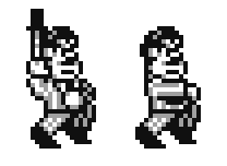
In the case of Gomez, who throws a knife while either standing, running, or jumping, I have designed the knife throwing poses of his attack animation to make sense no matter the context. In other words, if the player attacks while running, then the knife throw will seamlessly transition in and back out to the running animation and the same goes for when attacking from an idle or jumping state. This allows for the inclusion of a dynamic animation while still keeping the sprite count as low as possible. This may be tricky to do for some characters as it’s not always easy to find a single pose that seamlessly flows in between three or more states. You may need to create multiple versions of the same attack state but this runs the risk of bloating the sprite count. Alternatively, rather than watching that dreaded sprite count rise closer and closer to the limit with all new frames, another option is to design a small number of sprites that show an attack animation (an arm swinging a sword or hand firing a gun, for example) and attach this relatively small amount of animated sprites to the larger animation state. An example of this is Mega Man’s buster attack animations.
The Damage State
The damage graphics are self explanatory here. I have decided to go to the effort of including them because doing so will make the player really feel the hit when they take damage. Rather than coding in a simple flashing player character sprite when damaged, consider taking this moment to the next level.
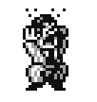
I have attempted to design this damaged state to transition smoothly across all other states in the game, and included details like a shocked look on Gomez’s face and beads of sweat flinging into the air. You can also heighten the feeling of getting hit by implementing an effective SFX and/or coding in a small camera shake.
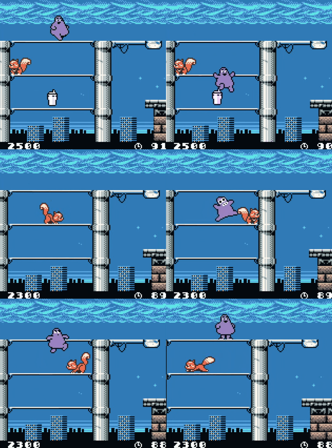
What we have been attempting to improve is what’s called game feel or in other words, aspects of a game that can be manipulated to make the players experience more engaging. This is an absolutely massive topic to discuss and you can expect me to cover it in more detail in the future. The techniques we have explored here make up only a small portion of the game feel tool set. Specifically, we have been modifying the game’s aesthetics to amplify the sense of action.
Since this is all about improving the player experience, I have created an example project of The Addams Family Redux. See for yourself how different the player character’s actions now feel as a result of making the graphics more detailed. If you want to learn how the Player Character was set up in GBS3.1 or play the demo ROM, a fully commented project file, ROM and .pocket file have been made available for download. You may also want to give The Addams Family for the Game Boy a play yourself and let us know how you would improve the experience in the GBS discord (I find it perplexing that the HUD is also acting as the Gomez mansion floor…).
This article has turned into a monster of an essay so I want to thank you for taking the time to read it in its entirety and last but not least, Happy Halloween!

Independent Games Designer, Artist, Film Enthusiast and Full-time Dad (he/him). Check out my games here!
