Coming in at 160×144 pixels, the Game Boy’s screen resolution is quite small. Relative to its non-portable 8-bit counterpart, the NES, the Game Boy has some… let’s say… disadvantages. When designing a Game Boy game, player size and the speed at which everything on the screen moves must be well-considered if game play is to remain fair. Our next game in this series, while by no means a particularly bad game, does fall short in this regard. Let’s jump into the next GB Redux and investigate how such a small screen resolution can negatively impact a player’s experience when developers don’t take this very important fact into consideration.
Wizards & Warriors on the NES was developed by Rare and released in 1987. It received praise enough to warrant two sequels on the platform and with that success, it’s only natural that the team at Rare tried their hand at porting the experience to the Game Boy.
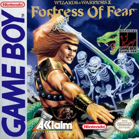
Wizards & Warriors X: The Fortress of Fear was released in 1990, the second year of the age of Game Boy. While it’s not a direct port of any of the NES titles, this game uses similar sprites in all their relatively oversized glory. All the details of the player, enemies, and pickups were preserved, giving them an abundance of character. But with this design choice, a problem that many earlier Game Boy platformers share was introduced. What I’m going to dub the “Proportion Problem” amounts to this: with large sprites comes a limited onscreen view of obstacles and threats, and with that comes very little time to register and react to them.
In the above image I have drawn a jump arc that the player needs to make in order to get across the platforms, and shown the trajectory of an incoming cannonball projectile. The problem with these large sprites becomes very apparent when the player lands on the platform, only to have the cannon spawn in and fire a large cannonball while the player is still concentrating on the jump!
This cramped style of game design leaves very little time for the player to react to the projectile. When this kind of setup occurs, the player often feels they have been shortchanged. With subsequent playthroughs, the player will be able to react in time, but the skill has shifted from quick thinking and fast (but fair!) reaction times to level layout memorization in order to “get good” at the game. Personally, it’s the former that makes for a fun and addicting action game while the latter leaves the player questioning whether the game is more interested in stabbing a sword through their heart than offering a moment’s fun.
So with that in mind, let’s take a look at a scene from Wizards & Warriors X: Fortress of Fear, and attempt to redesign some elements to improve the action gameplay experience!
Here we have a simple platforming setup. The player needs to jump on to the moving platform. Simple enough, right? But because the player sprite is so big and the jump arc is so proportionately long, the platform can only just be seen if we were to stand on the precipice of this death pit. It’s obvious now that some changes to the player meta sprite’s size will improve the player experience, but how big or small should we make the character? Time for some quantitative analysis!
In the above image, I have broken down the ratio of character size to view size in both the NES and Game Boy versions. The player meta sprite height to screen height in Wizards & Warriors on the NES has a ratio of 1:6 while Wizards & Warriors X comes in at 1:4. Quite the difference! Let’s redesign the player sprite so that it’s more in line with the 1:6 ratio and see how that will in turn accommodate some welcome changes to the level layout too.
The player is now nearly half the size of the original meta sprite but large enough to retain more or less the same amount of detail. The tip of the head is nearly three tiles high so, when crouching (a mechanic used to avoid incoming projectiles when pressing down on the D-pad), the hit-box will reduce its size further to 16×16 pixels or less. This will mean that relatively high projectiles can now be implemented to fire three tiles high but more importantly, the distance at which projectiles like cannonballs and arrows spawn in will be further away from the player, giving them a little more time to react. Here is our new meta sprite inserted back into the scene:
If we were to keep the jump arc proportional to the size of the player meta sprite (which is 2.5x the Player character height high and 6x the Player character width across), we can now shunt the platform further into the center of the screen. The player no longer has to be so cautious about dealing with the death pit and the platforming challenge it offers. This will improve the pace of the action and make this section more thrilling for those players that love to run through levels at a high speed.
While I was at it, I made some readability changes to the background art. If you want to learn more about how best to manage readability, you can read more in this article.
Now lets see how that cramped platform and enemy layout is affected with these changes:
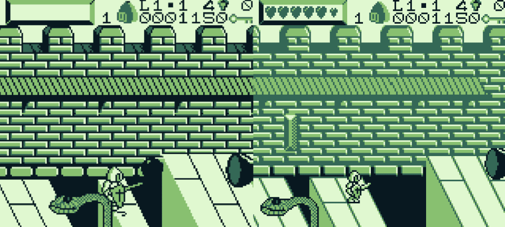
To finish up, I thought it might benefit us to take a quick look at not only some GB titles that have succeeded in solving the “Proportion Problem”, but also some important exceptions that have large meta sprites, and are still nonetheless a great success and learn why…
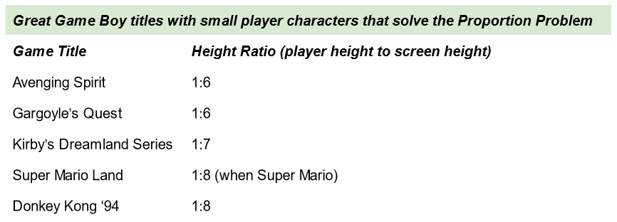
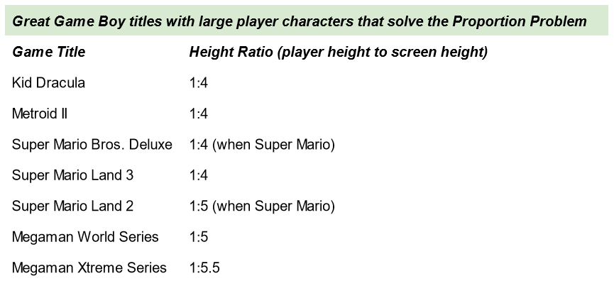
These are just a smattering of some worthwhile platformers on the Game Boy and GBC, but you can see that many of what I consider to be the best platformers on the system that also have large sprites tend to be games that have been either directly ported from the NES or have had their first title developed for the NES and a subsequent sequel has been developed for the GB.
Now I get that some developers don’t want to redesign an iconic sprite like 8-bit Mega Man. It’s tied to the branding after all, and changing the look could anger some die hard fans. But at the same time Mario, the most iconic video game character of all time, was redesigned to suit this reduction in resolution in Super Mario Land and with that change, makes for a fast-paced game (if you’re good at it).
What’s interesting is that in the case of Super Mario Land 2: 6 Golden Coins and Super Mario Land 3: Wario Land, Mario and Wario’s meta sprites were scaled back up so that they were more detailed and given more personality. But here is the thing, despite this return to the norm, the developers made changes to other aspects of the game design to accommodate the large sprites. On the whole, all the titles in Table 2 have this in common: the rate at which the player, enemies, and projectiles move in games from Table 2 is much slower compared to the titles in Table 1!
Samus is slow to move in Metroid II: Return of Samus, Mega Man is relatively slower to move compared to his rate of movement in the NES titles and so on. What’s more is that projectiles don’t just appear from somewhere off screen, they are telegraphed extremely well by the various enemies in the Mega Man titles, so there is plenty of time to prepare for an attack beforehand too. These are the key points to remember when making a fair platformer on the Game Boy and it can be boiled down to a simple rule:
The size of a player, enemies, and projectiles should be inversely proportional to the speed at which they move to maintain fairness when designing action platformers for the Game Boy.
So if you want a really fast paced action platformer, make your characters small to give the player a wide view of their surroundings. If you want lots of detail in your characters however, then consider slowing down the rate of movement of anything that requires a moments reaction time.
In the case of Super Mario Bros. Deluxe, a direct port of SMB for the NES, the developers included the option to move the view screen up and down or left and right to assist the player. It’s a great game of course, I do love playing it and that solution does help at least a little bit. Ultimately though, SMB DX can’t really compete when Mario is at full sprint on a big TV with the NES’s larger resolution. It’s perhaps the perfect comparison to make when showing exactly how important the Proportion Problem is to a Game Boy developer. Why don’t you play the two titles side by side and see how each feel for yourself!
Independent Games Designer, Artist, Film Enthusiast and Full-time Dad (he/him). Check out my games here!
